Most SaaS websites do not have a design problem. They have a clarity problem, a proof problem, or a friction problem. The best-performing SaaS sites in 2026 are not the most visually complex ones. They are the ones that explain the product in under 5 seconds, show proof immediately, and make it effortless for visitors to take the next step.
SaaS buyers are impatient. They are comparing five tools at once with six tabs open. If your website does not communicate what you do, who you serve, and why you are the right choice within the first few seconds, they are gone. No amount of clever animation or bold colour choices will fix a site that fails at clarity and conversion.
This guide covers the essential design principles, homepage frameworks, and best practices that high-converting SaaS websites use in 2026, with practical steps you can implement to turn your website into your most effective sales tool.
Why SaaS Website Design Is Different
SaaS websites face unique design challenges that set them apart from other business websites:
- You are selling something invisible. Unlike physical products, software cannot be held, tried on, or examined in person. Your website must make the product tangible through screenshots, demos, and clear explanations.
- The buying cycle involves research. SaaS buyers evaluate multiple alternatives, read reviews, compare features, and often involve multiple decision-makers. Your site must serve both quick evaluators and deep researchers.
- Conversion is not a purchase, it is a trial or demo. Most SaaS conversions are sign-ups, free trials, or demo requests, not direct purchases. The friction threshold is lower, but the need for trust is just as high.
- Content must serve multiple audiences. Your website needs to speak to end users, decision-makers, technical evaluators, and existing customers, often on the same page.
- The product evolves constantly. SaaS products ship updates frequently. Your website must be easy to update without requiring a full redesign every quarter.
12 SaaS Website Design Best Practices
1. Nail the Hero Section in 5 Seconds
Your hero section is the most valuable real estate on your entire website. It must answer three questions instantly: What is this product? Who is it for? Why should I care?
- Use a clear, specific headline (6 to 10 words). “Project management for remote engineering teams” is better than “Work smarter, not harder.”
- Add a supporting subheadline (1 to 2 sentences). Expand on the value proposition with specific benefits or outcomes.
- Include one primary CTA. “Start Free Trial” or “Book a Demo.” Avoid competing CTAs in the hero.
- Show the product. A real screenshot, animated walkthrough, or interactive demo is more credible than an illustration.
2. Show the Product, Not Illustrations
In 2026, the most effective SaaS websites replace generic illustrations with real product visuals. Animated interface demos, interactive product tours, and actual screenshots consistently outperform abstract graphics.
- Interactive demos (10 to 15 seconds): Let visitors experience key features without signing up. This is the fastest way to communicate product value.
- Animated walkthroughs: Short looping animations showing the product in action are more engaging than static screenshots.
- Real UI, not mockups: Showing your actual interface builds trust. Users want to see what they will actually use.
3. Put Social Proof Above the Fold
Proof outruns persuasion. The most effective SaaS websites position social proof high on the page, not buried near the footer.
- Client logos: Display logos of recognisable customers immediately below the hero. Even 4 to 6 logos create instant credibility.
- Metrics and numbers: “10,000+ teams use [Product]” or “99.9% uptime” provide concrete evidence of traction.
- Short testimonial quotes: A one-line testimonial with a real name, photo, and company is more powerful than a paragraph of marketing copy.
- Star ratings or review scores: Display ratings from G2, Capterra, or Trustpilot with direct links for verification.
4. Structure the Homepage for Conversion
High-converting SaaS homepages follow a proven structure:
- Hero section: Clear headline, supporting text, one CTA, product visual.
- Social proof bar: Client logos, metrics, or ratings.
- Problem-solution narrative: Describe the pain point your audience faces, then present your product as the solution.
- Key benefits (3 to 4 maximum): Focus on outcomes and value, not feature lists.
- Product demonstration: Interactive demo, video, or animated walkthrough.
- Detailed testimonial or case study: A deeper proof point with specific results.
- Pricing preview or comparison: Transparency about cost reduces friction and qualifies leads.
- Final CTA: Repeat the primary call-to-action at the bottom of the page.
Understanding the difference between landing pages and full websites helps you decide when a focused conversion page might outperform a multi-page experience.
5. Write for Clarity, Not Creativity
SaaS copywriting in 2026 rewards specificity over cleverness. Users are not looking for witty taglines. They want to understand your product immediately.
- Replace vague headlines with specific ones. “Automate invoice processing in 30 seconds” beats “Streamline your workflow.”
- Lead with outcomes, not features. “Reduce customer churn by 23%” is more compelling than “Advanced analytics dashboard.”
- Use your customer’s language. Read support tickets, sales call transcripts, and reviews. Use the exact words your customers use to describe their problems and goals.
- Eliminate jargon. If a prospect needs to Google a term to understand your headline, you have lost them.
6. Design for Speed
Speed equals trust. Sites loading in under 2 seconds perform significantly better than slower alternatives. For SaaS, where trust is everything, a slow website signals an unreliable product.
- Optimise all media: Compress images, use WebP format, and lazy load below-fold content.
- Minimise JavaScript: Heavy scripts slow initial page loads. Defer non-critical JS and remove unused libraries.
- Use functional animations, not decorative ones: Micro-animations showing how something works beat cinematic animations that slow down the page. 6-second loading animations cost revenue.
- Monitor Core Web Vitals: LCP under 2.5 seconds, INP under 200ms, CLS under 0.1.
7. Make Pricing Transparent
SaaS buyers expect to find pricing information on your website. Hiding pricing behind a “Contact Sales” wall frustrates users and increases bounce rates for all but enterprise-tier products.
- Display plans clearly: Show pricing tiers with clear feature comparisons. Use visual hierarchy to highlight the recommended plan.
- Include a free tier or trial: Offering a free plan or trial period reduces the commitment barrier dramatically.
- Annual vs monthly toggle: Show both options with the savings for annual billing clearly displayed.
- Avoid hidden costs: Be upfront about what is included. Surprise charges at checkout destroy trust.
8. Build Dedicated Feature and Use Case Pages
Your homepage cannot cover everything. Create dedicated pages for individual features, use cases, and audience segments.
- Feature pages: Each major feature gets its own page with detailed explanation, product screenshots, and a relevant CTA.
- Use case pages: “[Product] for Marketing Teams” or “[Product] for Remote Teams” speaks directly to specific audiences and targets long-tail search queries.
- Comparison pages: “[Product] vs [Competitor]” pages target high-intent commercial keywords and help buyers making direct comparisons.
- Integration pages: If your product integrates with popular tools, create pages for each integration. These target valuable search queries.
This page strategy is also powerful for SEO. Learn how blogging and content creation support search rankings alongside your product pages.
9. Simplify the Sign-Up Flow
Every additional step in your sign-up process loses users. One case study showed that reducing onboarding from 12 minutes to 4 minutes boosted activation by 29%.
- Reduce form fields: Ask for the minimum. Name, email, and password are usually enough to start. Collect additional details later during onboarding.
- Offer social sign-up: “Sign up with Google” removes the friction of creating new credentials entirely.
- Show progress: If your sign-up process has multiple steps, display a progress bar so users know how far along they are.
- Remove navigation on sign-up pages: Once a user starts signing up, remove the main navigation to eliminate distractions and keep them focused on completion.
10. Use White Space Strategically
The best SaaS websites in 2026 are doubling down on clean, whitespace-rich layouts that highlight what truly matters. White space is not wasted space. It is a deliberate design tool that:
- Reduces cognitive load: Users can process information faster when it is not competing with surrounding elements.
- Creates emphasis: A CTA button surrounded by generous white space is impossible to miss.
- Signals quality: Clean layouts feel premium and professional. Cluttered pages feel chaotic and untrustworthy.
- Improves readability: Generous line height, paragraph spacing, and section padding make content easier to scan and read.
11. Design for Mobile
Even in B2B SaaS, a significant portion of initial research happens on mobile devices. Decision-makers browse on phones during commutes, meetings, and evenings.
- Responsive layouts: Every page must work flawlessly on mobile, not just the homepage.
- Simplified navigation: Use a clean hamburger menu or bottom navigation on mobile.
- Touch-friendly CTAs: Buttons must be large enough to tap easily, minimum 48×48 pixels.
- Readable text: Minimum 16px body text without requiring zoom.
- Fast mobile load times: Mobile users are even more impatient than desktop users. Optimise aggressively for mobile speed.
12. Test and Iterate Continuously
The best SaaS website design in 2026 is a continuous experiment, not a one-time project. A/B testing, session replay analysis, and iterative optimisation replace once-a-decade redesigns.
- A/B test headlines: Small changes in hero copy can produce large differences in conversion rates.
- Analyse session recordings: Watch how real users interact with your site. Where do they hesitate? Where do they drop off?
- Heatmap analysis: Understand where users click, scroll, and spend time to identify what captures attention and what gets ignored.
- Monthly performance reviews: Track conversion rate, bounce rate, time on site, and sign-up completion rate monthly and iterate based on data.
Conversion rate optimisation (CRO) is the discipline of turning these insights into measurable improvements.
SaaS Web Design Trends in 2026
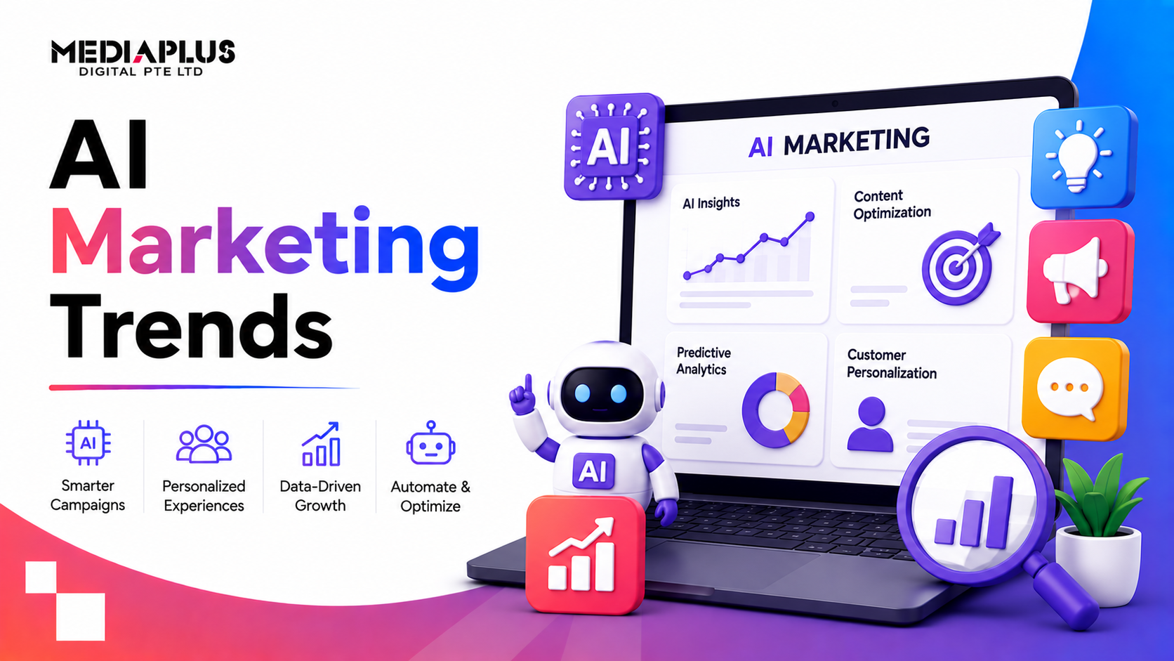
- AI-powered personalisation: Homepages that adapt messaging, testimonials, and feature highlights based on visitor type, industry, or company size.
- Opinionated minimalism: Black and white plus one bold accent colour is winning across enterprise SaaS. Clean, confident, and distinctive.
- Product-led growth (PLG) design: Websites designed to get users into the product as fast as possible, removing demo gatekeeping in favour of direct sign-up experiences.
- Hybrid visuals: Combining real product UI elements with human photography creates warmth and credibility simultaneously.
- Motion for function: Animations that demonstrate product functionality, not decorative flourishes that slow the page.
- Dark mode options: Many developer and technical SaaS tools now default to dark mode with light mode as an alternative.
Explore how AI is transforming digital marketing and web design to understand the technology behind these trends.
Common SaaS Website Design Mistakes
- Vague hero messaging: If your headline could apply to any SaaS product, it is too generic. Be specific about who you serve and what you solve.
- Burying social proof: Logos and testimonials near the footer are almost invisible. Move your strongest proof high on the page.
- Feature dumps instead of benefit stories: Lists of features without context are meaningless. Show how each feature solves a real problem.
- No clear CTA hierarchy: When “Book Demo,” “Start Trial,” “Watch Video,” and “Contact Sales” all compete equally, users choose nothing.
- Ignoring page speed: Heavy hero videos and unoptimised images cost you both rankings and conversions.
- Designing in isolation: SaaS website design should involve marketing, product, and sales teams, not just designers.
Build a SaaS Website That Converts
Your SaaS website is your most important sales asset. It works 24/7, reaches every prospect, and shapes every first impression. Getting the design right is not about following trends. It is about removing friction, building trust, and making the product obvious.
MediaPlus Digital – website design agency builds high-performing websites for technology and SaaS companies across Malaysia and the region. From custom web design and development to SEO and performance marketing, the team delivers websites that are designed to convert and built to scale.
Ready to build a SaaS website that drives growth? Contact MediaPlus Digital to discuss your project.