A website is often the first real interaction users have with your brand. Before they read your copy or understand your offer, they judge your credibility based on design, structure, and usability.
Studies consistently show that users form an opinion about a website in seconds. Good website design is not about trends or aesthetics alone. It is about clarity, usability, and guiding users toward meaningful actions.
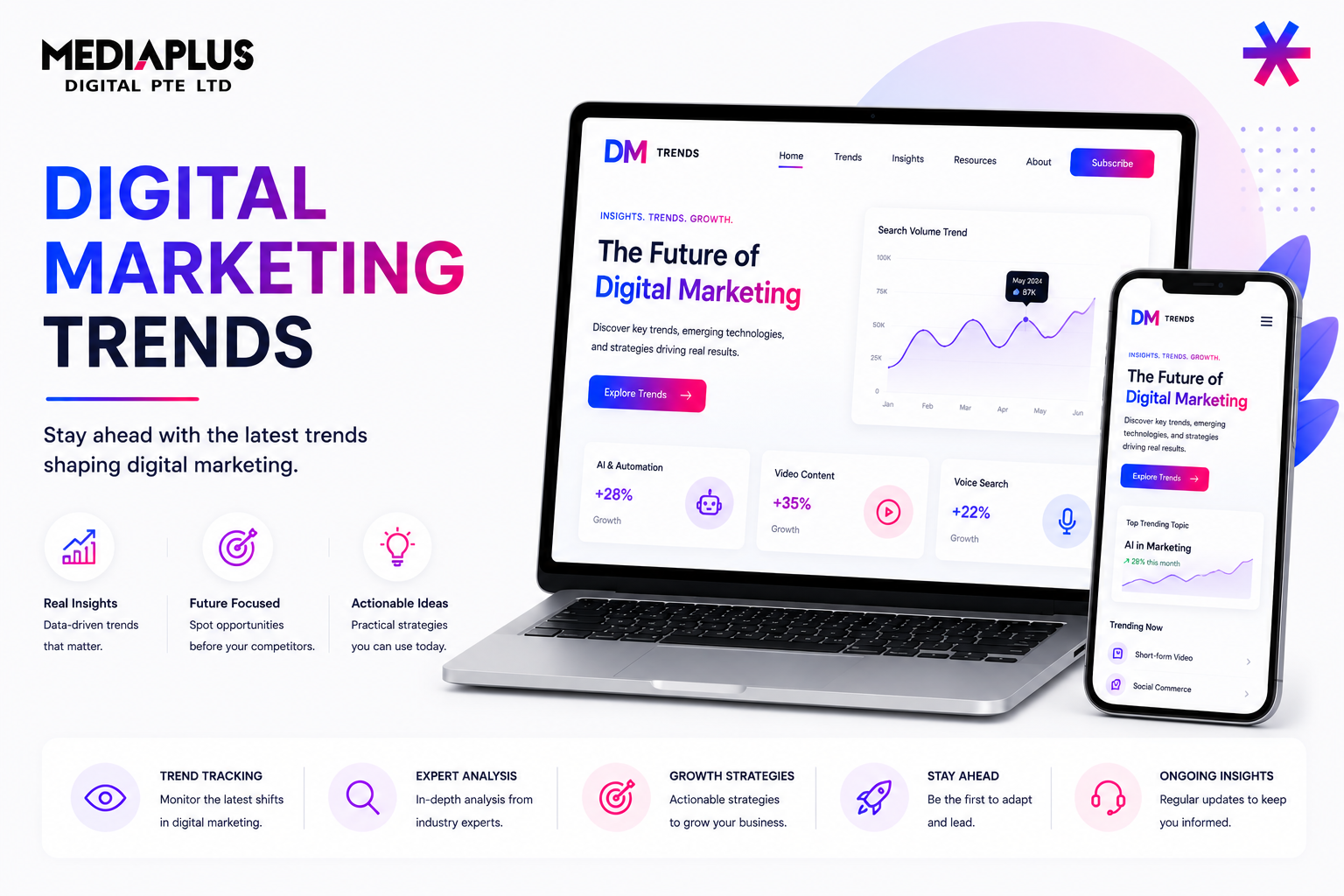
Below are practical website design tips that help improve user experience, engagement, and conversions.
1. Keep the Homepage Clean and Focused
Your homepage has a very small window to make an impression. Multiple usability studies show that users form an opinion about a website in 0.05 seconds, and most visitors decide whether to stay or leave within the first 5–10 seconds. This means your core message must be instantly clear.
Most users do not read word by word. Eye-tracking research consistently shows that people scan pages in an F-shaped pattern, focusing first on headlines, visuals, and prominent elements.
Best practices to follow:
-
Clearly state your main value proposition above the fold
-
Limit competing messages or secondary offers
-
Use whitespace to separate sections and reduce visual noise
-
Include one primary call to action that stands out
From a performance perspective, clutter also hurts conversions. Research by Google found that visually complex websites are perceived as less trustworthy, and pages with too many elements increase cognitive load. When users feel overwhelmed, they hesitate, and hesitation leads to exits.
A clean homepage reduces decision fatigue and helps users quickly understand who you are, what you offer, and what they should do next.
2. Design With Visual Hierarchy in Mind
Visual hierarchy is what tells users where to look first, second, and third. Without it, users are forced to figure things out on their own, which slows them down and increases bounce rates.
Strong visual hierarchy is built through size, contrast, spacing, and positioning.
Key principles to apply:
-
Headlines should be noticeably larger and bolder than body text
-
Important messages should appear higher on the page
-
Buttons and CTAs should contrast clearly with surrounding elements
-
Supporting content should be visually lighter and less dominant
According to UX studies, users typically focus on the top third of a page first. CTAs placed in high-attention zones can significantly increase interaction rates. In conversion tests, simply improving visual hierarchy and CTA placement has been shown to lift conversions by 10–30%, without changing the copy.
When hierarchy is clear, users do not need instructions. Their eyes naturally follow the intended flow, making the experience feel effortless and intuitive.
3. Make Content Easy to Read
Readability has a direct impact on how long users stay on your site and whether they engage with your content.
Studies show that users read online content 25–30% slower than print. If text is dense, low-contrast, or poorly structured, users will abandon the page quickly.
To improve readability:
-
Use a minimum body text size of 16px for desktop and larger for mobile
-
Ensure strong contrast between text and background to meet accessibility standards
-
Keep paragraphs short, ideally 2–3 lines
-
Use subheadings, bullet points, and spacing to break up content
Font choice also matters. Sans-serif fonts such as Arial, Inter, or Roboto tend to perform better for long-form web content because they are easier to scan on screens.
Improving readability is not just about aesthetics. Clear, scannable content can reduce bounce rates and increase average session duration, which indirectly supports SEO and conversion performance.
Good design removes friction. When users can read and understand content effortlessly, they are far more likely to stay, explore, and take action.
4. Prioritise Simple and Intuitive Navigation
Navigation is the backbone of user experience. If users cannot easily find what they are looking for, they leave. Studies show that over 60% of users abandon a website if navigation feels confusing or unpredictable.
Good navigation should feel familiar. Users should not have to learn how your website works.
Effective navigation includes:
-
A clear, visible main menu that is easy to scan
-
Logical grouping of pages based on user intent, not internal structure
-
A clickable logo that always links back to the homepage
-
Footer navigation for important secondary links such as About, Contact, Privacy Policy, or FAQs
From an SEO perspective, clear navigation also helps search engines understand your site structure. Well-organised internal links improve crawlability and help distribute ranking signals across pages.
When navigation is intuitive, users move deeper into the site, page views increase, and bounce rates drop. These are strong signals of a healthy, user-friendly website.
5. Optimise for Mobile First
Mobile traffic is no longer secondary. According to global data, more than 55% of all web traffic now comes from mobile devices, and Google uses mobile-first indexing by default.
This means Google primarily evaluates the mobile version of your website for ranking and indexing.
Mobile-first design principles include:
-
Prioritising essential content and removing non-critical elements
-
Simplifying layouts to avoid horizontal scrolling
-
Using larger buttons and touch-friendly spacing
-
Ensuring forms, menus, and checkout flows work smoothly on small screens
Research shows that 53% of users abandon a mobile site if it takes longer than 3 seconds to load. Mobile optimisation is not just about layout, it is about performance, clarity, and ease of interaction.
A website that works well on mobile almost always performs better on desktop too. Mobile-first design forces clarity and discipline, which improves the overall experience across all devices.
6. Use Clear and Compelling Calls to Action
Every page should guide users toward a next step. Without a clear call to action, users are left guessing, and uncertainty kills conversions.
Strong CTAs share a few key characteristics:
-
Action-oriented language that clearly states what happens next
-
Visual contrast so the CTA stands out from surrounding content
-
Placement at natural decision points, not hidden at the bottom
-
Specific wording instead of vague phrases
Examples of effective CTAs include:
-
Get Started
-
Request a Quote
-
Book a Consultation
-
Download the Guide
Conversion rate optimisation studies consistently show that clear CTAs can improve conversions by 20 to 40 percent, even without changing traffic sources.
A good CTA reduces friction. It answers the user’s silent question: “What should I do now?” When that answer is obvious, users are far more likely to take action.
7. Maintain Visual Consistency
Visual consistency is one of the strongest signals of professionalism and trust. When users see the same visual patterns repeated across pages, they feel more confident navigating and interacting with the site.
To maintain consistency:
-
Limit your colour palette to a small, defined set
-
Use the same font families and font sizes across all pages
-
Keep button styles, hover states, and icons uniform
-
Apply consistent spacing, alignment, and layout patterns
Research in UX psychology shows that consistent interfaces reduce cognitive load by up to 30 percent, allowing users to focus on content and actions instead of figuring out how the site works.
Inconsistent design, on the other hand, makes a website feel fragmented and unfinished. Even if the content is strong, visual inconsistency can reduce credibility and lower conversion rates.
8. Improve Page Speed and Performance
Website speed is not just a technical concern. It directly affects user perception, trust, and conversion behaviour.
Slow websites:
-
Increase bounce rates
-
Reduce engagement and conversions
-
Negatively impact search rankings
According to Google, a 1-second delay in page load time can reduce conversions by up to 20 percent. Users expect websites to load almost instantly, especially on mobile.
Performance-focused design tips:
-
Compress and properly size images
-
Avoid unnecessary animations and heavy visual effects
-
Reduce third-party scripts and tracking where possible
-
Use lightweight, performance-optimised themes and layouts
A fast website feels smoother, more responsive, and more trustworthy. Users are more likely to stay, explore, and convert when performance friction is removed.
9. Design for Accessibility
Accessible design ensures that your website can be used by everyone, including users with visual, motor, or cognitive impairments.
Key accessibility considerations include:
-
Sufficient colour contrast between text and background
-
Descriptive alt text for images
-
Keyboard-friendly navigation for users who cannot use a mouse
-
Readable font sizes and clear line spacing
Accessibility is not just about compliance. It improves usability for all users. Clear contrast helps mobile users in bright environments. Larger buttons help everyone on touch devices.
From an SEO perspective, accessible websites are easier for search engines to crawl and understand. Clean structure, proper headings, and descriptive text benefit both users and rankings.
10. Test, Measure, and Improve Continuously
No website is perfect at launch. The best-performing websites are treated as ongoing products, not one-time projects.
Use data to guide improvement:
-
Track user behaviour with analytics tools
-
Run A/B tests on layouts, headlines, and CTAs
-
Review heatmaps and session recordings to identify friction points
-
Iterate based on real user actions, not assumptions
Studies show that data-driven design decisions can improve conversion rates by 10 to 30 percent over time, without increasing traffic.
Great websites evolve. They adapt to user behaviour, business goals, and changing expectations. Continuous testing and optimisation turn a good website into a high-performing one.
Final Thoughts
Effective website design is about balance. A site can look great, but without clear structure, smooth navigation, and strong performance, it will struggle to deliver results. Visual appeal should always support usability and conversion, not compete with them.
The best-performing websites consistently:
-
Communicate value within seconds
-
Guide users intuitively through the page
-
Load fast and perform reliably across all devices
-
Improve over time through data-driven optimisation
Whether you are planning a redesign or building from scratch, strong fundamentals matter more than trends. Especially in competitive markets like web design Malaysia, success comes from designing with users in mind and aligning every design decision with real business goals.