User experience is not a design luxury. It is a business essential. Every second of frustration, every confusing navigation choice, and every slow-loading page costs you visitors, leads, and revenue.
The data is clear: Walmart’s mobile-first UX redesign increased conversions by 20% and mobile orders by 98%. Websites that load in under 2 seconds have conversion rates 3x higher than those loading in 5 seconds. And according to Nielsen Norman Group, you only need to test with 5 users to uncover 85% of usability problems.
Improving your website’s user experience does not always require a complete redesign. Often, targeted improvements to speed, navigation, content, and calls-to-action can produce significant, measurable results. This guide covers 12 proven strategies to improve your website UX, with practical steps you can start implementing today.
What Is Website User Experience?
Website user experience (UX) encompasses every aspect of a visitor’s interaction with your website. It includes how easy it is to find information, how quickly pages load, how intuitive the navigation feels, how clear the content is, and how smoothly users can complete their goals (making a purchase, submitting a form, booking an appointment).
Good UX is invisible. When your website works well, users accomplish their goals effortlessly without noticing the design decisions that made it possible. Bad UX is immediately noticeable: confusing menus, slow pages, broken forms, and layouts that force users to work harder than they should.
Google recognises this too. User experience signals like page speed, mobile usability, and engagement metrics directly influence search rankings, making UX improvement both a conversion strategy and an SEO strategy.
Why Website User Experience Matters
- Higher conversion rates: Research shows that excellent UX can boost conversion rates by 300 to 400%. Every friction point you remove from the user journey means more completed actions.
- Lower bounce rates: Users who can quickly find what they need stay longer and explore more pages. Confusing or slow experiences drive them to competitors.
- Better SEO performance: Google measures user experience signals including Core Web Vitals, mobile usability, and engagement metrics. Good UX supports higher search rankings.
- Reduced support costs: Intuitive websites generate fewer “how do I” support queries. Clear navigation, helpful error messages, and logical workflows reduce support volume.
- Increased customer loyalty: Users who enjoy interacting with your website come back. Positive experiences build brand trust and encourage repeat business.
- Competitive advantage: When competitors offer similar products or services, the business with the better user experience wins.
Understanding why website design is important starts with recognising that UX directly impacts your bottom line.
12 Strategies to Improve Website User Experience
1. Improve Page Load Speed
53% of mobile users abandon sites that take longer than 3 seconds to load. Page speed is the first UX impression your website makes. No amount of great content or beautiful design matters if users leave before the page finishes loading.
How to improve speed:
- Compress images: Convert to WebP format. A typical 2MB JPEG becomes 200KB in WebP with no visible quality loss.
- Minimise code: Remove unused CSS and JavaScript. Compress and bundle remaining files.
- Enable lazy loading: Load images and videos only when they scroll into view.
- Use a CDN: Content Delivery Networks serve files from servers closest to your user, reducing load times.
- Choose fast hosting: Reliable hosting with fast servers is the foundation of site speed.
- Meet Core Web Vitals: Target LCP under 2.5 seconds, INP under 200ms, and CLS under 0.1.
MediaPlus Digital provides reliable domain and hosting services with fast servers and 99.9% uptime to support optimal site performance.
2. Simplify Navigation
If users cannot find what they need within a few seconds, they leave. Navigation is the most critical UX element on your website.
- Limit top-level menu items to 5 to 7: Too many options create decision paralysis. Group related pages under clear parent categories.
- Use descriptive labels: “SEO Services” is more helpful than “Solutions.” Navigation labels should tell users exactly what they will find.
- Add breadcrumbs: Breadcrumb navigation shows users where they are in the site hierarchy and provides easy navigation back to parent pages.
- Implement search: For content-rich sites, a prominent search bar lets users jump directly to what they need.
- Keep navigation consistent: The menu should look and behave the same on every page. Consistency builds user confidence.
- Design for mobile: Mobile navigation should be thumb-friendly with a clean hamburger menu or bottom navigation bar.
3. Design for Mobile First
Over 60% of global web traffic comes from mobile devices. In Malaysia, mobile usage is even higher at over 80%. If your website is not optimised for mobile, you are providing a poor experience to the majority of your visitors.
- Responsive design: Use flexible layouts that adapt to any screen size. Test on actual devices, not just browser resizing.
- Touch-friendly targets: Buttons and links should be at least 48×48 pixels with adequate spacing between them.
- Readable text: Body text should be at least 16px on mobile without requiring pinch-to-zoom.
- Simplified forms: Use shorter forms on mobile. Enable autofill and use appropriate input types (email, phone, number) for better keyboard experiences.
- Fast mobile loading: Mobile users are often on slower connections. Optimise aggressively for mobile speed.
4. Create Clear Calls-to-Action
Every page on your website should guide users toward a specific action. If your CTA is hard to find, unclear, or competing with too many other options, users will leave without converting.
- Make CTAs visually prominent: Use contrasting colours, adequate size, and generous white space around CTA buttons so they stand out from surrounding content.
- Use action-oriented language: “Get a Free Quote,” “Start Your Trial,” or “Book a Consultation” tells users exactly what will happen. Avoid vague labels like “Submit” or “Learn More.”
- Limit choices per page: One primary CTA per page section. Secondary CTAs should be visually subordinate to the primary action.
- Place CTAs strategically: Above the fold, after key content sections, and at the bottom of the page. Do not make users hunt for the next step.
- Test CTA variations: A/B test button colours, copy, placement, and size to find what converts best for your audience.
For detailed guidance, explore proven strategies to increase website conversion rates.
5. Improve Content Readability
Most web users do not read content word by word. They scan. Your content must be formatted for scanning:
- Short paragraphs: 2 to 3 sentences maximum. Large blocks of text are intimidating and get skipped.
- Clear headings and subheadings: Use a logical H1, H2, H3 hierarchy that lets users scan the page structure instantly.
- Bullet points and numbered lists: Break information into scannable lists wherever possible.
- Bold key phrases: Highlight important information so scanning users catch the essential points.
- Adequate line height: 1.5 to 1.8 line height for body text improves readability significantly.
- Sufficient contrast: Dark text on a light background with a minimum contrast ratio of 4.5:1.
6. Use Visual Hierarchy Effectively
Visual hierarchy controls what users see first, second, and third on every page. Without it, everything competes for attention and nothing stands out.
- Size signals importance: Larger elements attract attention first. Your main headline should be significantly larger than supporting text.
- Contrast creates focus: High-contrast elements (bright CTA on muted background) draw the eye immediately.
- White space adds emphasis: Important elements surrounded by generous space stand out more than elements crowded by others.
- Consistent patterns: Consistent heading styles, button designs, and spacing across pages help users build mental models of your site.
7. Build Trust Through Design
Users decide whether to trust a website within seconds. Design choices directly influence that judgment:
- Professional design quality: Outdated, amateur-looking websites erode trust immediately. A polished, modern design signals legitimacy.
- Social proof: Display client logos, customer testimonials, review scores, and case studies prominently. 94% of consumers say reviews influence their purchasing decisions.
- Security indicators: HTTPS padlock, trust badges, and secure payment icons reassure users about data safety.
- Clear contact information: Display your phone number, email, address, and business hours prominently. Hidden contact details create suspicion.
- About page: A detailed about page with real team photos, company history, and credentials humanises your brand and builds trust.
8. Optimise Forms for Conversion
Forms are where user experience directly impacts your bottom line. Every unnecessary field, confusing label, or unclear error message costs you conversions.
- Reduce form fields: Ask only for essential information. Every additional field reduces completion rates. Name, email, and phone number are usually sufficient for initial contact.
- Use smart defaults: Pre-select common options, auto-detect location, and use placeholder text to guide users.
- Display clear error messages: Show specific error messages next to the relevant field (“Please enter a valid email address”) rather than vague messages at the top of the form.
- Show progress: For multi-step forms, display a progress bar so users know how far along they are.
- Confirm submission: Show a clear confirmation message or redirect to a thank-you page after submission. Users need to know their action was successful.
9. Make Your Website Accessible
Web accessibility ensures your website works for everyone, including the over 1 billion people globally with disabilities. Accessible websites also tend to have better UX for all users and benefit from improved SEO.
- Alt text for images: Descriptive alt text helps screen reader users and improves image SEO.
- Colour contrast: Meet WCAG AA standards with a minimum contrast ratio of 4.5:1 for body text.
- Keyboard navigation: All interactive elements should be reachable and usable via keyboard.
- Readable fonts: Minimum 16px body text. Avoid decorative fonts for important content.
- Focus indicators: Visible focus states help keyboard users know which element is currently selected.
- Form labels: Every form field should have a visible label, not just placeholder text that disappears when the user starts typing.
Websites that improve accessibility see an average 23% increase in traffic, demonstrating that accessibility benefits everyone, not just users with disabilities.
10. Conduct Regular User Testing
Assumptions about what users want are often wrong. User testing replaces guesswork with evidence.
- Start with 5 users: Nielsen Norman Group research shows that testing with just 5 users uncovers 85% of usability problems.
- Give users real tasks: “Find the pricing page” or “Book a consultation” reveals navigation and flow issues that analytics alone cannot show.
- Use session recordings: Tools like Hotjar and FullStory let you watch how real users interact with your site, revealing where they hesitate, get confused, or abandon.
- Analyse heatmaps: Heatmaps show where users click, scroll, and spend time, identifying which elements attract attention and which get ignored.
- A/B test improvements: When you identify an issue, test solutions before implementing permanently. Small changes to headlines, CTAs, or layouts can produce significant conversion improvements.
11. Personalise the Experience
In 2026, users expect websites to adapt to their needs:
- Personalised recommendations: Show products, content, or services based on browsing history and user behaviour. Netflix attributes 75% of viewer activity to personalised recommendations.
- Location-based content: Display relevant contact information, pricing, or content based on the user’s location.
- Returning visitor recognition: Acknowledge returning users with relevant content, recently viewed items, or personalised messaging.
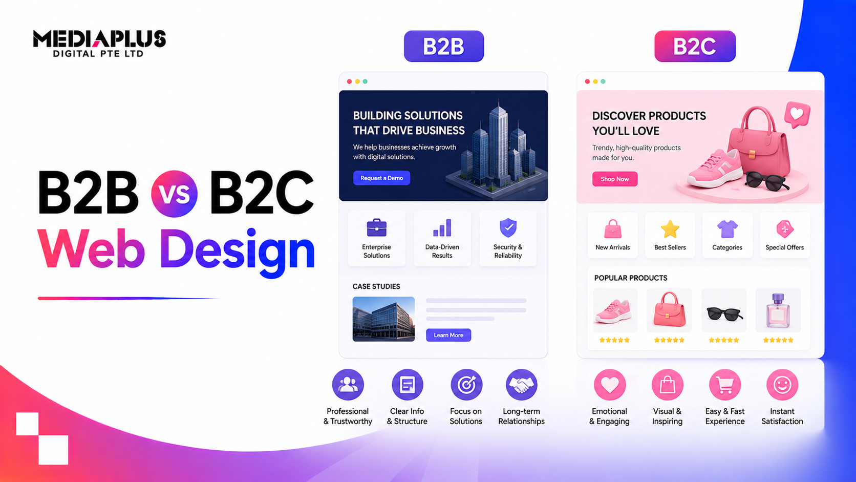
- Role-based experiences: For B2B sites, adapt content based on whether the visitor is a decision-maker, technical evaluator, or end user.
Learn how AI is transforming digital marketing and enabling new levels of website personalisation.
12. Provide Clear Feedback for Every Action
Users need to know that their actions are being recognised and processed:
- Button states: Buttons should visually change on hover, click, and when loading. A button that does nothing visually after being clicked creates uncertainty.
- Loading indicators: Research shows users tolerate 3x longer wait times when shown progress indicators. Always show loading states for actions that take time.
- Success confirmations: After a form submission, purchase, or account action, display a clear confirmation message.
- Error prevention: Disable impossible actions (like selecting past dates for bookings), validate inputs in real-time, and provide clear guidance on required formats.
- Undo options: When possible, allow users to reverse actions. Gmail’s “undo send” feature is a perfect example of prioritising user control.
How to Measure Website User Experience
|
Metric |
What It Tells You |
|
Bounce rate |
Percentage of users who leave after one page (lower is better) |
|
Average time on page |
How long users engage with content (higher is usually better) |
|
Pages per session |
How many pages users explore per visit (higher indicates good navigation) |
|
Conversion rate |
Percentage of visitors who complete desired actions |
|
Task completion rate |
Percentage of users who successfully complete key tasks |
|
Core Web Vitals |
Technical performance scores (LCP, INP, CLS) |
|
System Usability Scale (SUS) |
Standardised post-test questionnaire score (aim for 68+) |
|
Net Promoter Score (NPS) |
How likely users are to recommend your site (aim for 50+) |
Regularly monitoring these metrics helps you identify UX problems early and measure the impact of improvements. Conversion rate optimisation (CRO) uses these metrics systematically to drive continuous UX improvements.
Common UX Mistakes to Avoid
- Designing for yourself, not your users: Your personal preferences may not match your audience’s needs. Let data and user feedback guide design decisions.
- Too much content above the fold: Cramming everything into the first screen overwhelms users. Prioritise one clear message and CTA.
- Auto-playing video or audio: Unexpected sound is one of the most common user complaints. Always let users control media playback.
- Intrusive pop-ups: Pop-ups that block content immediately on arrival frustrate users and can be penalised by Google on mobile.
- Inconsistent design: Different button styles, heading treatments, and layouts across pages create confusion and reduce trust.
- Ignoring mobile: Testing only on desktop and assuming mobile “will work” is a recipe for lost conversions.
- Never testing with users: Building a website without user testing is like navigating without a map. You might get there, but you will take unnecessary detours.
Improve Your Website User Experience Today
Improving website user experience is not a one-time project. It is an ongoing process of testing, learning, and optimising. The businesses that invest in UX consistently see better engagement, higher conversions, and stronger customer loyalty.
MediaPlus Digital builds websites with user experience at the core. From custom web design and development to SEO integration and conversion rate optimisation, the team delivers websites that look great and perform even better. With over 1,000 websites delivered and a Google Partner certification, MediaPlus Digital understands what it takes to create user experiences that drive business growth.
Ready to improve your website’s user experience? Contact MediaPlus Digital for a UX audit and consultation.