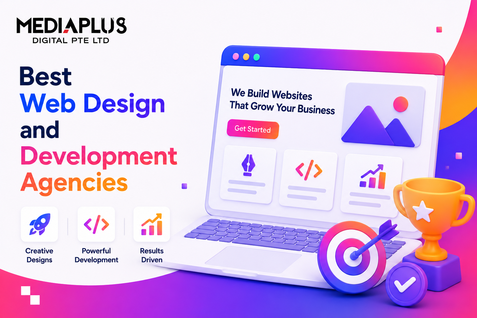
If 2024 was the year AI crashed into design and 2025 was the year designers figured out what to do with it, 2026 is the year UI matures. We are past the “everything has AI sparkle” phase. The trends defining this year are quieter, more thoughtful, and more business-driven. Interfaces that respect users’ attention, work across more contexts, and convert better.
Below are the 10 UI trends actually shaping serious product and website work in 2026, sourced from what is shipping at top studios (Linear, Figma, Vercel, Stripe, Cursor, Raycast) rather than Dribbble eye-candy.
1. AI as a Calm Copilot, Not a Loud Autopilot
The shift: The 2024 and 2025 “AI-powered everything” era with floating sparkle icons is being replaced by AI that is available but not in your face. The best 2026 interfaces hide AI behind a single shortcut (Cmd+K, Cmd+J), expose it only when relevant, and let users stay in their flow.
Examples in the wild:
- Linear’s command palette plus AI ticket triage
- Notion AI in the toolbar (not pop-ups)
- Raycast and Arc browser’s quiet AI surfaces
How to apply:
- Default AI off or collapsed. Surface only on user-triggered action.
- One global keyboard shortcut for AI invocation.
- Streaming responses. Do not make users wait for a wall of text.
- Always show the source. Let users edit and undo.
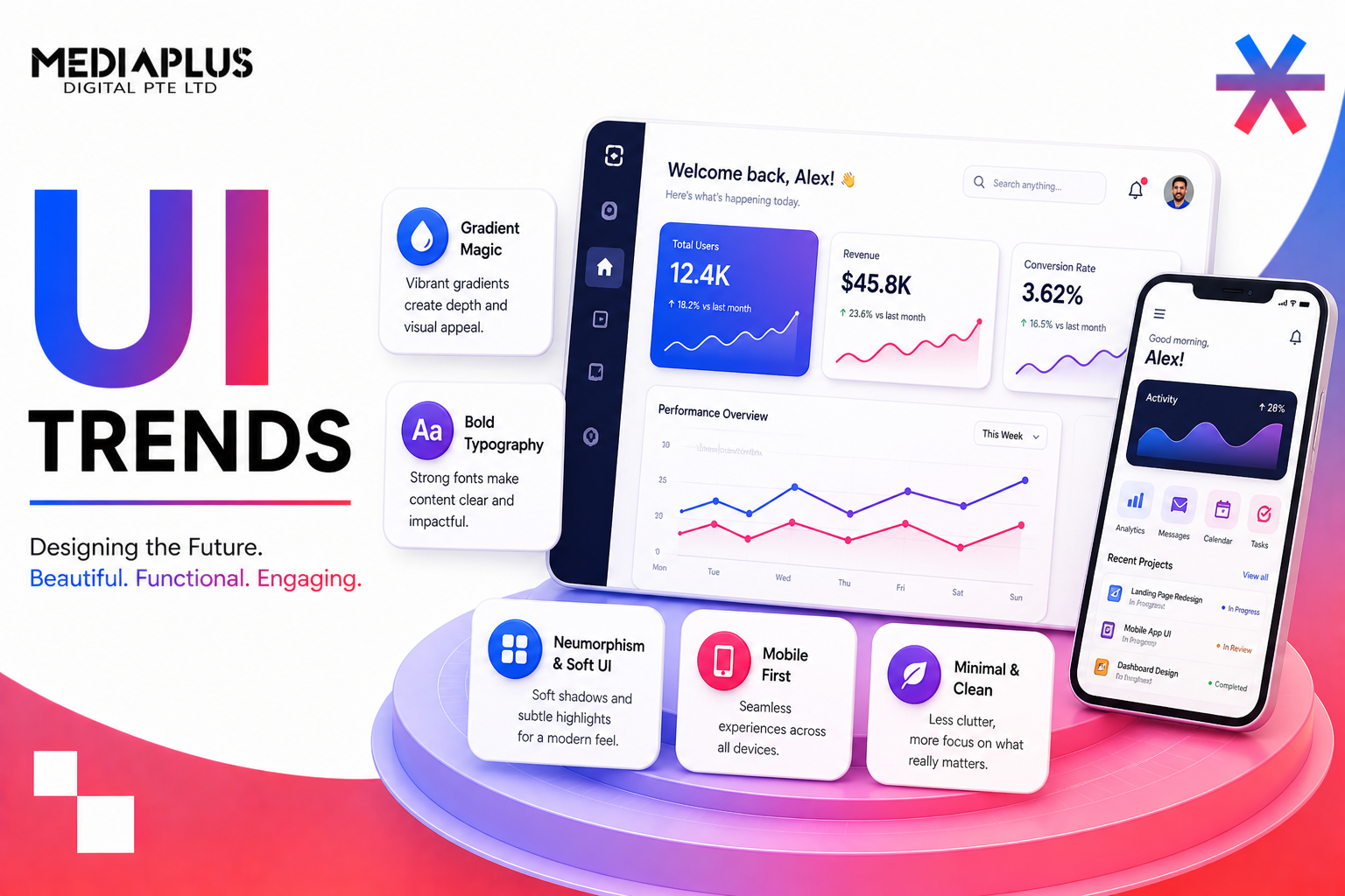
2. Bento Box Layouts
The shift: The hero-image plus 3-feature-card landing page formula is dead in 2026. Replacing it: bento grids, the modular card-based layouts borrowed from Apple’s product pages and pushed mainstream by Vercel, Figma, Cursor, and Stripe.
Why it works: Bento layouts let you show 6 to 12 product features visually in the space of 2 to 3 traditional cards. They reduce vertical scroll and feel more product-native than marketing fluff.
How to apply:
- 12-column grid base
- Mix card sizes (1 by 1, 1 by 2, 2 by 2)
- Each card represents one feature, illustrated with mini-UI screenshots or animated micro-interactions
- Maintain visual rhythm. Do not randomise sizes.
3. Bold, Typography-Forward Hero Sections
The shift: Hero illustrations and stock photography are being replaced by massive expressive typography. Brands like Stripe, Linear, Anthropic, Vercel, and Apple all lead with words sized 80 to 200 pixels, not pictures.
Why: Typography loads instantly (good for LCP), expresses brand without literal imagery, and outperforms generic stock visuals on memorability tests.
How to apply:
- Pair one display font plus one body font (no more)
- Use variable fonts for responsive weight and width
- Headline copy is 6 to 12 words maximum
- Optional: subtle gradient text or one accent colour on a key word
4. The Return of Bold, Saturated Colour
The shift: After 5-plus years of muted neutrals and soft pastels, 2026 brings back high-saturation, high-contrast palettes. Driven by Y2K nostalgia and “dopamine design” research showing colourful UIs increase emotional engagement by 22 to 31 percent.
What is in:
- Cobalt blues, electric reds, vivid oranges, neon greens
- Bold black-on-yellow or white-on-magenta combinations
- Gradients in unexpected pairings (purple to lime, teal to coral)
What is out:
- All-grayscale “minimalism”
- Single-pastel everything
- Generic “tech blue” where every SaaS company looks identical
How to apply (carefully):
- One bold colour plus neutrals, not 5 bold colours
- Pass WCAG AA contrast checks. Boldness does not mean unreadable.
- Use colour for hierarchy and emphasis, not decoration.
5. Calm Interfaces and Reduced Cognitive Load
The shift: Counterpoint to bold colour: calm design. Generous white space, fewer elements per screen, intentional pacing. Apps designed to not compete for attention, because users are exhausted by notifications, dashboards, and AI prompts everywhere.
Examples: Roam Research’s editor, Headspace, Things 3, Linear’s empty states.
How to apply:
- 1.5 to 2 times more white space than felt comfortable in 2022
- Fewer items per screen (5 to 7 maximum, not 12 to 20)
- Stronger visual hierarchy (clear primary, secondary, tertiary)
- Skip “loading skeletons everywhere”. Show only one progressive loader.
6. Accessibility as Infrastructure, Not a Feature
The shift: WCAG AA is no longer a “nice-to-have add-on”. It is the default starting point for 2026 designs. Driven by regulatory pressure (EU AAA, US ADA lawsuits, Malaysia’s PDPA 2024) and the realisation that accessible UIs convert better for everyone.
What this means in practice:
- 4.5:1 minimum contrast on body text (7:1 for AAA)
- Focus states designed, not browser defaults
- Reduced motion alternatives (CSS prefers-reduced-motion)
- Voice and keyboard-first navigation paths
- Captions and transcripts as defaults, not afterthoughts
- Alt text written like product copy, not “image of woman smiling”
7. Adaptive and Variable Typography
The shift: Variable fonts (Inter, JetBrains Mono, Geist, IBM Plex) let one font file express dozens of weights, widths, and styles. 2026 is when designers finally use the full range. Headlines morph weight on scroll. Body text adapts width on viewport change. Animated weight transitions on hover.
How to apply:
- Adopt at least one variable font in your stack
- Use weight variation for hierarchy. Do not just rely on size.
- Animate weight on critical hover states (subtle, 150 to 200ms)
- Use optical sizing axes for body versus display
8. 3D, Motion, and Scroll-Driven Storytelling
The shift: 3D used to mean clunky three.js demos that crashed phones. In 2026, WebGL-powered 3D scenes, scroll-triggered storytelling, and subtle parallax are everywhere. Apple, Stripe, Linear, Vercel, Framer.
Performance reality check: Do not ship 3D that adds 4MB to your bundle. Use Spline, Rive, or Lottie for lightweight motion (50 to 200KB) instead of full Three.js scenes for marketing pages.
How to apply:
- One scroll-driven moment per page. Overuse kills it.
- Always provide a reduced-motion alternative.
- Test on a 3-year-old Android. If it judders, simplify.
- For 80 percent of cases, Lottie or Rive beats custom Three.js.
9. Skeuomorphism 2.0: Tactile, Material UI
The shift: Flat design ruled from 2014 to 2024. 2026 brings back subtle skeuomorphism: soft shadows, glass morphism, gentle gradients, depth. But executed cleanly, not the leather-and-stitching maximalism of iOS 6.
Examples: macOS Sonoma’s widgets, Vision Pro’s spatial UI, Linear’s command palette glass effect, Stripe’s payment buttons.
How to apply:
- Use translucent surfaces (backdrop-blur in CSS) for floating elements
- Soft 30 to 60 percent opacity drop shadows, not hard 90 percent black
- Subtle gradients within UI elements, not just backgrounds
- Slight “pressable” feel on buttons (mini-scale on active)
10. Sustainability and Performance as a Design Decision
The shift: Designers in 2026 think about file size, load time, and carbon footprint as first-class design constraints, not just developer concerns. A 4MB hero video is not “premium” anymore. It is wasteful and bad for SEO.
What this looks like:
- Hero typography instead of hero video (loads 50 times faster)
- WebP or AVIF images as standard, not JPG or PNG
- Decorative SVGs over decorative images
- Dark mode reduces OLED power draw 20 to 40 percent. Give users the option.
- Static where possible, animated where it serves users, not designers’ portfolios
Bonus: What Is Quietly Dying in 2026
A few patterns we are seeing dropped from serious product work this year:
- Glassmorphism overload (still useful in moderation, but full-glass UIs are over)
- 3D blob illustrations (you know the ones)
- AI sparkle icons everywhere
- Carousels for primary content (still bad for engagement, still in use, still wrong)
- Pop-up newsletter modals after 2 seconds
- Cookie banners that cover the entire screen
- “Premium” feeling equals dark grey plus small text. Accessibility lawsuits ended this.
How to Apply 2026 UI Trends Without Looking Like Everyone Else
Trends are a starting point, not a destination. The risk in 2026 is that every site adopts bento layouts, bold typography, and variable fonts, and starts to look identical (the “Stripe-Linear-Vercel” homogeneity).
Three ways to stand out while staying current:
- Pick 2 to 3 trends, not 10. A site that does bento, typography, and calm design beats one that tries to do everything.
- Localise to your audience. Malaysian B2C audiences respond differently from US B2B SaaS audiences. Test colour and density choices specifically with your market.
- Reinforce, do not replace, brand. Your brand voice and identity come first. Trends serve the brand. They do not lead it.
For a deeper breakdown of how these trends combine with the must-haves of every business site, read our guide to the 15 key features of a website.
Frequently Asked Questions
Are UI trends worth following for business websites?
Yes if applied selectively. Trends affect user expectations. Sites that ignore them too long start to feel dated, which hurts trust. But chasing every trend leads to a homogenous look that does not differentiate your brand.
How do UI trends affect SEO?
Indirectly but significantly. Performance-aware design (trend 10) directly improves Core Web Vitals. Accessibility (trend 6) is increasingly weighted by Google. Calm UI (trend 5) reduces bounce rate. Trends that prioritise users align with what Google rewards.
What UI trends should Malaysian businesses prioritise?
For Malaysian B2C: bold colour (trend 4) plus calm UI (trend 5) work well because Malaysian audiences respond to warmth and clarity. For B2B: typography-forward heros (trend 3) plus bento layouts (trend 2) plus AI-as-copilot (trend 1) signal modernity. Accessibility (trend 6) is essential across the board.
How often should we redesign our website to keep up with UI trends?
A meaningful redesign every 3 to 4 years is healthy. Smaller iterative updates (typography refresh, colour palette tune, bento layout for a key section) can be done yearly. Avoid full redesigns more often than every 2 years. It is expensive and resets your SEO gains.
Will AI replace UI designers in 2026?
No, but it will reshape the role. AI is becoming an excellent first-draft tool (wireframes, asset generation, copy suggestions). The strategic work (research, IA, brand expression, accessibility, business outcomes) still needs human designers. The designers who adopt AI as a copilot ship 2 to 3 times faster than those who resist it.
Related Reading
- 15 Key Features of a Website Every Malaysian Business Needs
- B2B Digital Marketing Malaysia: The 2026 Playbook
- Headless CMS for Ecommerce in Malaysia: 8 Platforms Compared
Want a 2026-Ready Website?
We design and build websites that apply the UI trends that matter (bento layouts, calm interfaces, accessible-by-default, performance-tuned) without the overdesigned Dribbble look that does not convert. From Shopify stores and WooCommerce sites to high-converting landing pages and ecommerce builds.
Book a Free Design Consultation or WhatsApp +60 11 4072 0868 today.