In today’s digital economy, a corporate website is often the first meaningful interaction between a brand and its audience. A well-designed corporate site does more than look good — it communicates trust, supports conversions, and drives long-term growth.
Research shows that 48% of users believe a website’s design is the number one factor in determining a company’s credibility. First impressions matter: if a site feels outdated, slow, or confusing, users are likely to abandon it within seconds. In fact, Google data shows that 53% of mobile users leave a site that takes longer than 3 seconds to load.
Here are 12 inspiring corporate website design examples that strike the right balance between aesthetics, performance, and business outcomes and what you can learn from each.
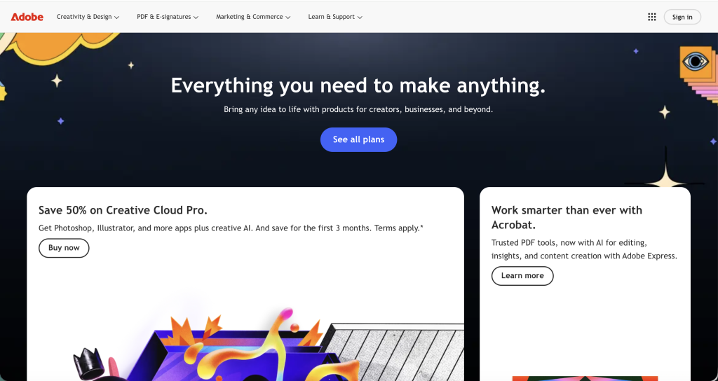
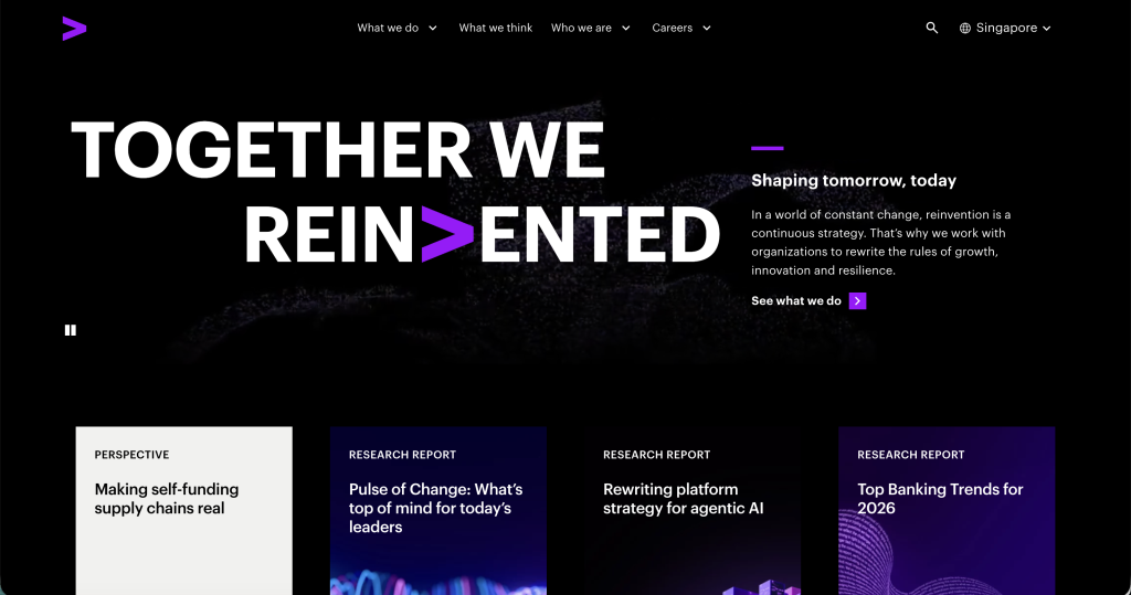
1. Adobe – Modular Design, Clear Value, High Engagement
Adobe’s corporate site uses a modular layout that helps users instantly scan key products and tools. Given Adobe’s vast ecosystem from Photoshop to Adobe Experience Cloud structuring content in digestible blocks is essential.
Data points:
-
Adobe uses visual tunnels to reduce cognitive load, helping users process complex product sets.
-
A/B testing industry benchmarks suggest improving modular clarity can increase engagement by 20–30%.
What works here:
-
Clear, layered hierarchy with large headings and CTA buttons
-
Smart use of whitespace
-
Product previews that cater to distinct user segments (creatives, enterprises, educators)
This design demonstrates how a corporate site can remain visually rich without overwhelming visitors.
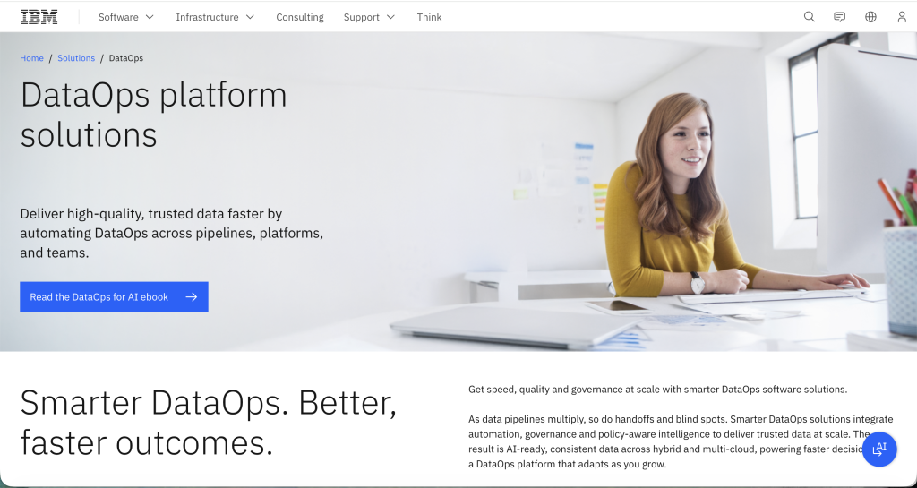
2. IBM – Trustworthy, Minimal, Enterprise-Focused
IBM’s homepage is minimalist yet authoritative. The corporate design focuses on clarity and access to decisionsupport content like research and case studies critical for B2B audiences with long sales cycles.
Data points:
-
Long-form content and thought leadership pages can boost dwell time by up to 60%, a signal Google uses to judge relevancy.
What works here:
-
Clean structure that prioritises enterprise information
-
Subtle motion cues that guide eyes without distraction
-
Consistent use of a monochromatic palette with splashes of accent colour
For large tech brands, simplicity and information clarity work hand-in-hand.
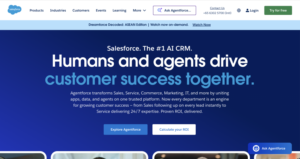
3. Salesforce – Clear Value Path With Social Proof
Salesforce’s homepage pairs a compelling value message with clear conversion pathways. Rather than overwhelming the user with options, the design funnels visitors into tailored flows.
Data points:
-
Adding social proof (e.g., “trusted by 150,000 companies worldwide”) can lift conversions by 15–30%.
What works here:
-
Multiple points of entry based on user role or goal
-
Product demos and interactive previews integrated within page flow
-
Strategic trust elements (logos, testimonials)
This design shows how complex product portfolios can be presented without user fatigue.
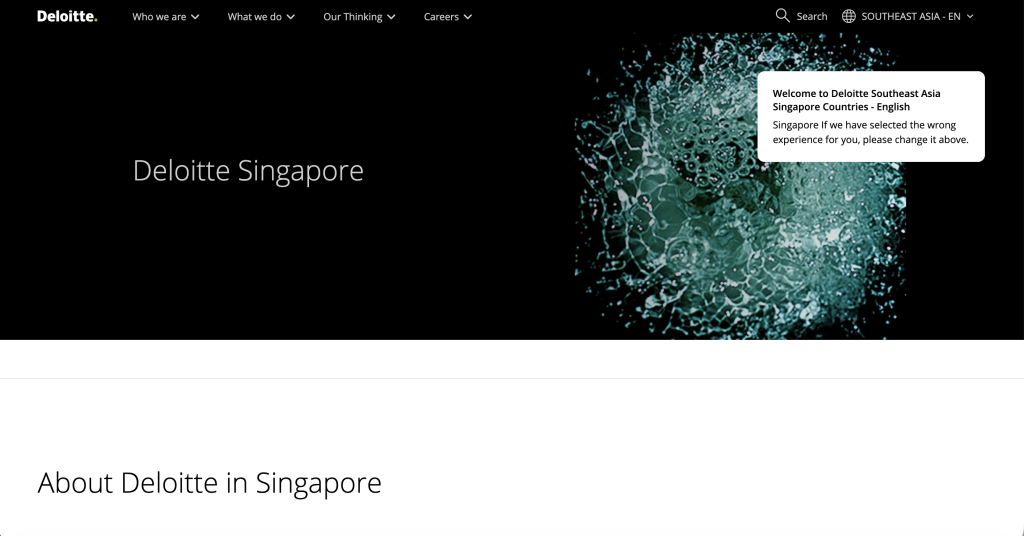
4. Deloitte – Content-Led, Authority-Driven
Deloitte’s site emphasises insights and research. Corporate services sectors rely on credibility and expertise, and Deloitte’s design reflects that with editorial-style content that supports conversion over time.
Data points:
-
Users are 2.5x more likely to engage with content that offers insights vs. generic product pages.
What works here:
-
Clean editorial card layout
-
Read times displayed to help scanners decide what to engage with
-
Very light navigation that keeps focus on insight content
For advisory or consulting brands, thought leadership becomes a core part of conversion.
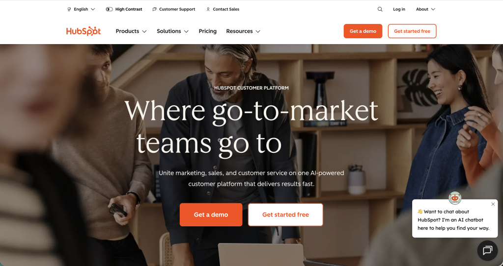
5. HubSpot – Solution-First with Metrics
HubSpot’s homepage is both welcoming and actionable. It uses data cues and outcome-oriented visuals to communicate the platform’s impact.
Data points:
-
Companies using data-driven storytelling increase lead engagement by 30–50%.
What works here:
-
Visual previews of product insights
-
Real traffic or success metrics used meaningfully
-
Modular blocks for product categories
HubSpot’s site balances friendliness with enterprise credibility.
6. Accenture – Bold, Modern, Brand-Forward
Accenture’s homepage feels dynamic and modern, suitable for a consultancy that leads with innovation. It prioritises motion and visual identity as part of content narratives.
Data points:
-
Balanced animation and motion improves engagement without harming performance when lazy-loaded or limited to viewport.
What works here:
-
Design system anchored in brand motifs
-
Smooth transitions that add perceived speed
-
Strategic placement of credibility elements (awards, partnerships)
For brands seeking a visual identity boost, Accenture’s site is a strong reference.
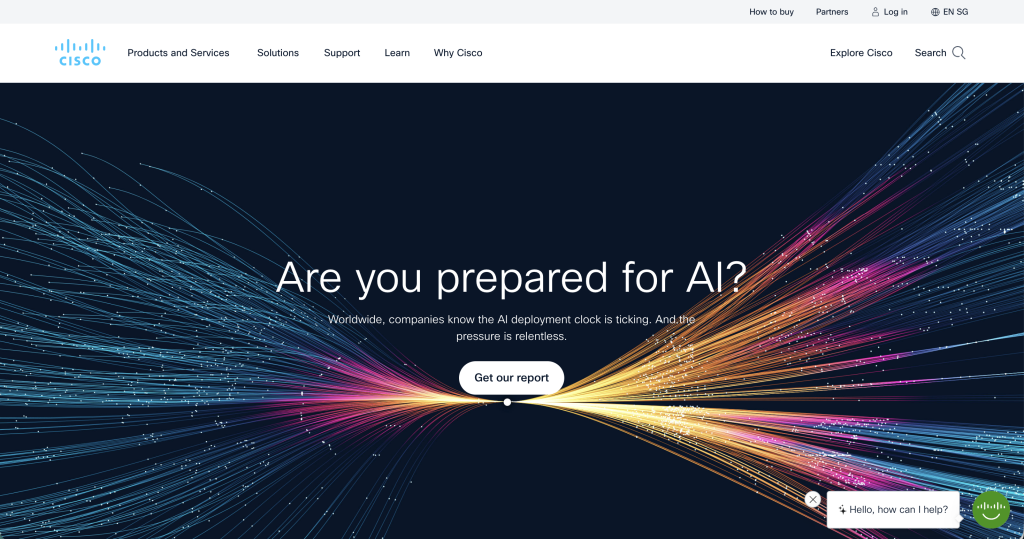
7. Cisco – Systematic, Function-First
Cisco’s corporate site demonstrates how technical brands can organise complex data and product categories without chaos. Its muted palette and iconography lift clarity.
Data points:
-
Users are 2x more likely to explore a site with a consistent symbol language and predictable navigation.
What works here:
-
Quick access icons for support and documentation
-
Modular content grouped by solution types
-
Extensive resource links without clutter
This model is ideal for enterprise technology sites with breadth of offerings.
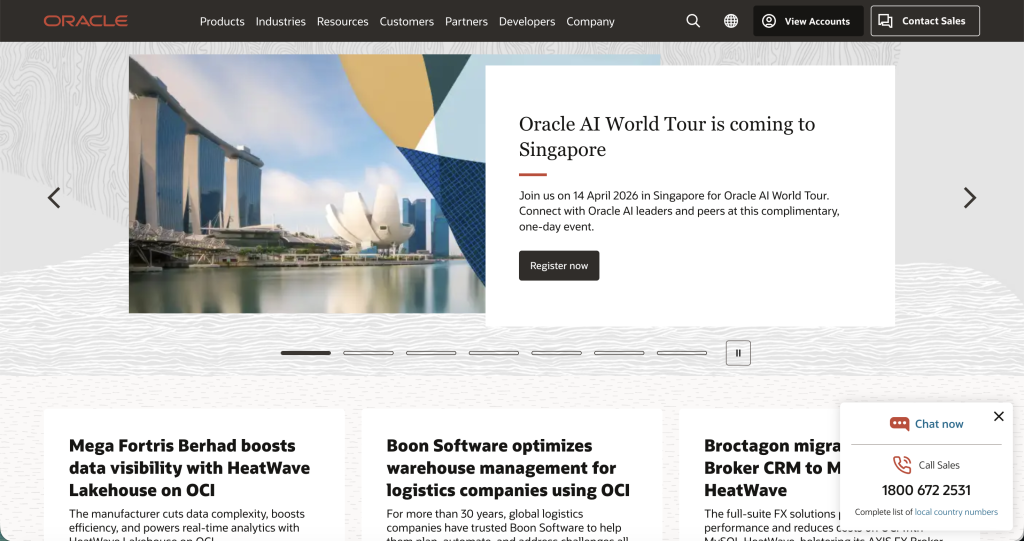
8. Oracle – Case Studies as Conversion Anchors
Oracle’s homepage leads with case studies a smart move for an enterprise brand where trust precedes conversion.
Data points:
-
Case studies showing real customer results can boost lead quality by 25–40% when tied to conversion CTAs.
What works here:
-
Rotating hero with customer case narratives
-
Clear node separation between cloud services and featured stories
-
Credibility via recognised enterprise brands
This design proves the power of repositioning customers as proof points.
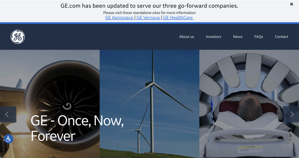
9. General Electric (GE) – Cohesive Structural Storytelling
GE’s corporate design reflects its current business evolution with a segmented structure: GE Aerospace, GE Vernova, and GE HealthCare.
Data points:
-
Structuring content by business segment can reduce bounce rates by 10–20%.
What works here:
-
Hero carousels that signal breadth of industry impact
-
Logical separation of business units
-
Accessibility tools integrated into layout
This site balances legacy and future with minimal cognitive friction.
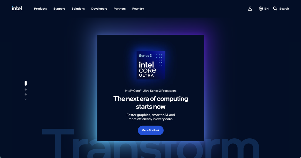
10. Intel – Clear Product Pathways and Developer Focus
Intel’s homepage is product objective-driven, with a focus on allowing different audiences from developers to enterprise buyers to find relevant resources.
Data points:
-
Developer and community sections often increase repeat traffic by 30–60%.
What works here:
-
Persistent navigation with developer pathways
-
Layered storytelling for complex technologies
-
Integrated community links
Tech brands seeking engagement beyond simple product pages should take note.
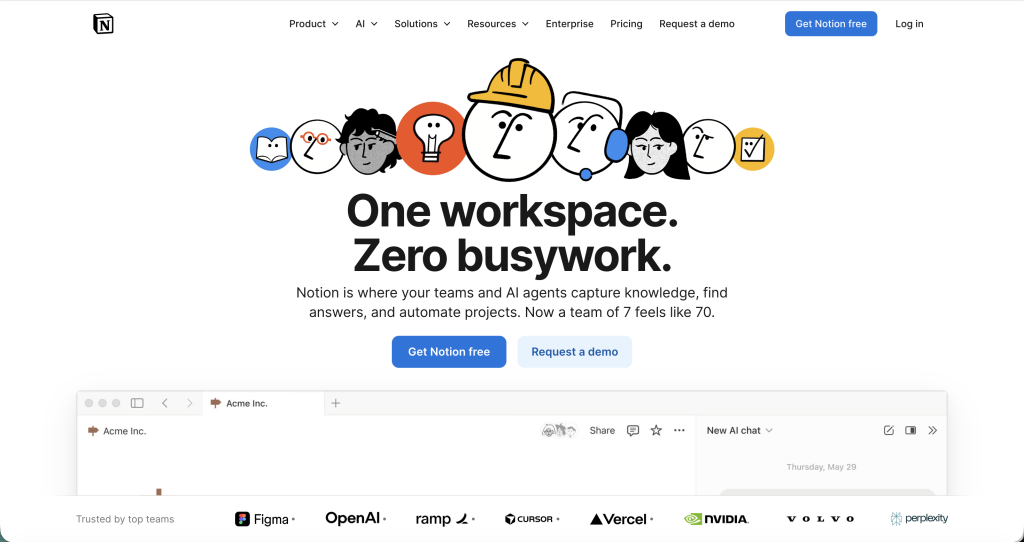
11. Notion – Simplified Product Narrative
Notion’s corporate design excels at explaining a multifaceted product in clear, visual terms. Its user segmentation sections let individuals see relevance instantly.
Data points:
-
Simplicity in messaging short, clear benefits increases conversion intent by 42%.
What works here:
-
Clear headline with immediate value proposition
-
Illustration and animation that demystify complexity
-
Multiple tailored user pathways
For collaborative products or SaaS, this design demonstrates how clarity leads to adoption.
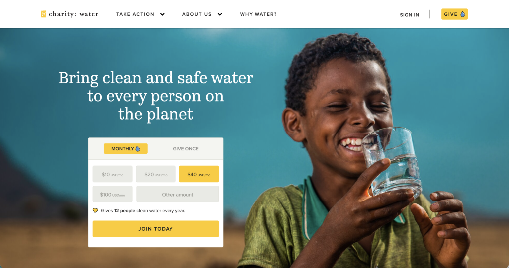
12. Charity: Water – Emotional Narrative with Clear Action
Charity: Water’s site weaves purpose and data into a concise, compelling narrative. It blends impact stories with clear calls to action.
Data points:
-
Nonprofits that show how donations are used increase giving conversion rates by 50–70%.
What works here:
-
Hero imagery with emotional pull
-
Transparent impact reporting with statistics
-
Frequent CTAs integrated into content
This site proves that even mission-driven sites need strong UX and performance.
Key Design Principles From These Examples
Across all 12 sites, several common themes emerge:
- Clear Value Proposition Up Front: Most leading corporate sites communicate the primary value in the first 2–3 seconds.
- Balanced Visuals and Performance: Heavy visuals do not mean slow sites. When optimised properly, imagery supports engagement without compromising speed a key ranking factor in Google’s Core Web Vitals.
- Structured Content Pathways: Segmenting content for specific audiences and goals increases engagement depth and reduces bounce rates.
- Trust and Social Proof: Logos, case studies, awards, benchmarks, and data points improve credibility especially important for B2B brands.
Final Thought
Corporate website design is no longer about “just looking good.” Effective corporate sites blend speed, structure, messaging, credibility, and clarity to support business growth.
These examples show how top brands build trust, facilitate discovery, and guide conversions a framework any company can adapt.
For businesses in ASEAN and beyond exploring how to implement these principles locally, web design Malaysia embraces the same standards of clarity, performance, and strategic content alignment. Well-designed corporate websites do more than inform; they define how audiences perceive and trust a brand in a competitive digital landscape.