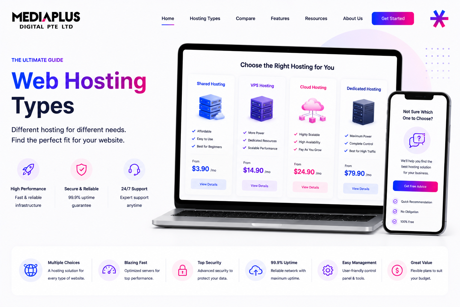
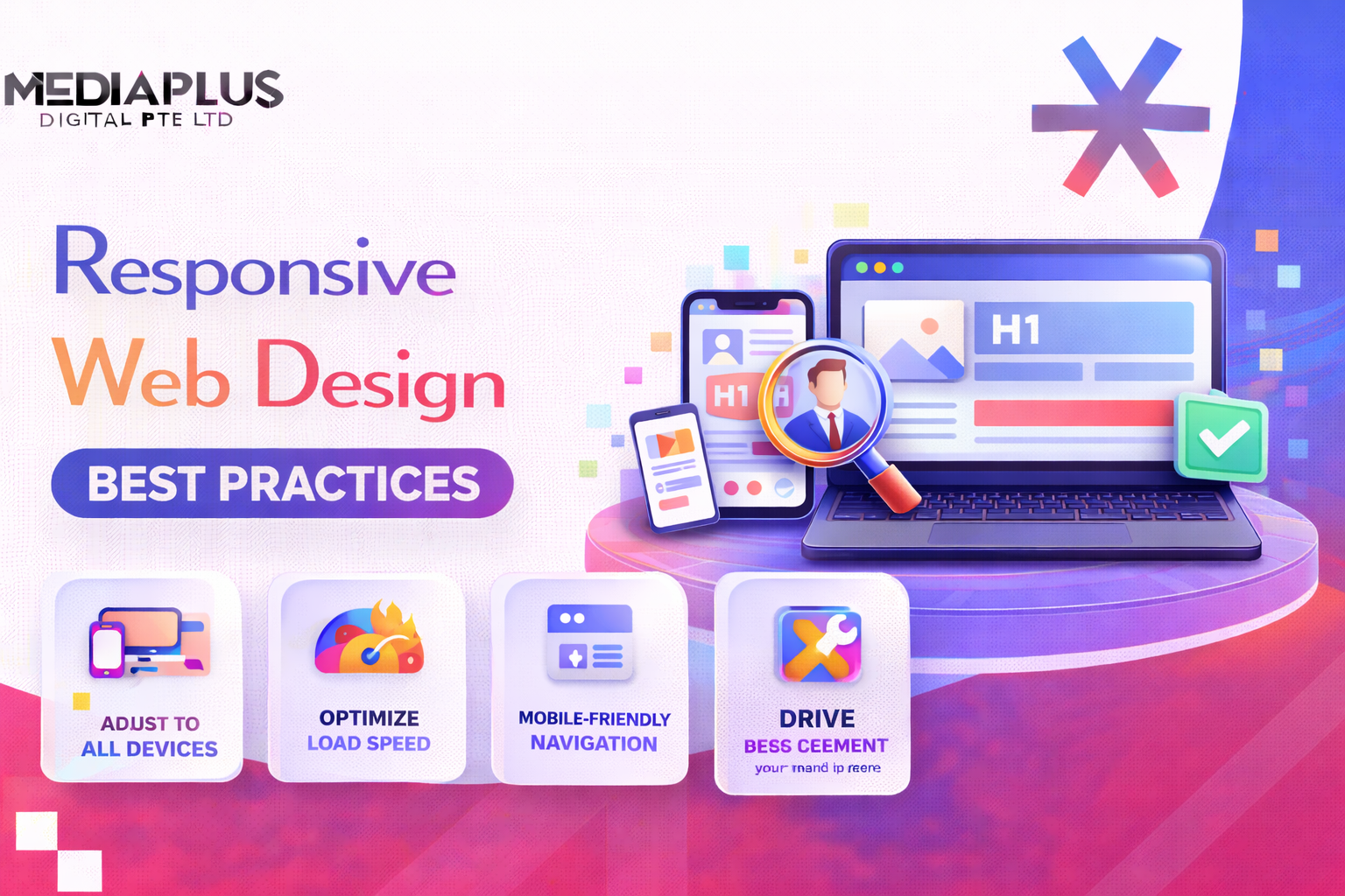
In 2026, people in Malaysia expect websites to work smoothly across every device they use. With mobile traffic making up more than 60 percent of global usage, responsive web design (RWD) isn’t just a bonus, it’s a core requirement. A responsive site ensures visitors get a consistent, easy experience whether they’re browsing on a phone in KL, a tablet in Penang, or a desktop in Johor Bahru. It also plays a big role in accessibility, performance, and SEO.
This guide by Media Plus takes you through the fundamentals of responsive web design, the principles behind it, and modern techniques like container queries and fluid typography, along with examples of brands that do it well.
What Is Responsive Web Design?
Responsive web design is an approach where your website automatically adjusts its layout, visuals, and content based on the viewer’s screen size. Instead of building separate mobile and desktop versions, you create one flexible design that adapts using tools like CSS media queries, fluid grids, and scalable typography.
A responsive website:
- Keeps design and usability consistent across devices
- Loads efficiently even on slower connections
- Strengthens accessibility and SEO through mobile optimization

Why Responsive Design Matters in 2026
Responsive design isn’t just about making a site look good on different screens. In 2026, it plays a direct role in how well your website ranks, how people interact with your content and how future-proof your digital presence is. Here’s why it matters more than ever.
1. Mobile-First Indexing
Google now evaluates websites primarily through their mobile versions. That means your mobile layout, loading speed and usability directly influence how well you appear in search results. If a site loads slowly, uses tiny text or forces users to zoom, Google reads that as a poor mobile experience and lowers its ranking. A responsive site that adapts cleanly to smaller screens protects your visibility and helps you stay competitive in Malaysian search results.
2. Better User Experience
Visitors expect everything to work instantly. They shouldn’t need to pinch, zoom or fight with horizontal scroll bars. Responsive design keeps layouts clean, buttons easy to tap and text readable on any device. This improves the overall experience and keeps users browsing longer. A smoother experience reduces bounce rates and encourages people to click deeper into your pages, view your services and take action.
3. Stronger Core Web Vitals
Core Web Vitals have become essential indicators of real-world performance. Metrics like LCP, CLS and INP reveal how fast your site loads, how stable the layout feels and how quickly it responds to user input. A well-built responsive layout reduces layout shifts, improves loading times and makes interactions feel snappy. These improvements help your site rank better and create a more enjoyable experience for visitors across Malaysia.
4. Adaptability for Future Devices
The market evolves fast. Foldable phones, tablets, ultrawide monitors, smart displays and wearable screens are already common. Each new category introduces new dimensions and new challenges. With a strong responsive foundation, your website naturally adapts without needing a full redesign every few years. This saves development time and ensures your site continues to perform well no matter what devices your audience uses next.

Core Principles of Responsive Web Design
Responsive design is built on five main principles. These shape how layouts behave across screen sizes and ensure the experience stays polished and consistent.
1. Fluid Grids
Fluid grids are one of the core building blocks of responsive design. Instead of using fixed pixel-based widths, they rely on relative units like percentages, em or rem. This allows the layout to resize naturally as the screen changes, keeping spacing and structure consistent across devices.
Fluid grids ensure that content doesn’t feel cramped on small screens or stretched on large monitors. They help maintain a balanced visual rhythm, which improves both readability and overall user experience.
Example:
Best practices:
-
Use percentage-based widths so elements scale with the viewport
-
Apply max-width to prevent layouts from expanding too much on wide screens
-
Combine fluid grids with Flexbox or CSS Grid for more control and alignment
-
Avoid overly nested layouts because they make responsiveness harder to maintain
A well-built fluid grid helps prevent horizontal scrolling, keeps content readable and supports a smoother mobile experience, which is crucial for engagement and conversions.
2. Flexible Images
Images often take up the most space on a webpage, so making them responsive is essential for both design and performance. Without proper handling, images can overflow their containers or load at unnecessarily large sizes.
A simple CSS rule ensures images resize automatically while keeping their proportions intact.
Basic rule:
Beyond this, modern optimization plays a big role in speed and SEO. Resizing and compressing images helps pages load faster, especially on mobile devices with slower networks.
Modern optimization includes:
-
Using next-generation formats like WebP or AVIF for smaller file sizes
-
Adding
srcsetandsizesso browsers choose the best resolution for each screen -
Enabling lazy loading for images below the fold to improve loading performance
These techniques reduce data usage, boost Core Web Vitals and create a smoother experience across all devices.
3. Media Queries
Media queries are the foundation of responsive design logic. They let you apply different CSS rules depending on screen size, orientation or resolution. Instead of building separate pages for different devices, you adjust the layout based on conditions.
Common breakpoints are often used as starting points, but the idea is to design layouts that adapt smoothly rather than relying on dozens of fixed breakpoints.
Common breakpoints:
-
480px and below for mobile
-
481px to 768px for tablets
-
769px to 1024px for small desktops
-
1200px and above for large screens
Example:
Media queries can also handle more advanced use cases like:
-
High-resolution displays
-
Dark or light mode preferences
-
Landscape or portrait orientation
Using media queries effectively keeps layouts organized and ensures that every screen size gets an optimized design.
4. Container Queries
Container queries are one of the most powerful additions to modern CSS. Instead of adjusting styles based on the entire viewport, components respond based on the size of their parent container. This is especially useful for modular or component-based designs.
For example, a card layout can show one column inside a small container and two columns inside a larger one, regardless of the overall screen size.
Example:
To enable container queries, you must define the parent container:
Container queries help designers create reusable components that behave consistently across different contexts. They are especially useful for Malaysian e-commerce websites, dashboards and content-heavy CMS layouts where components appear in multiple places with different widths.
5. Fluid Typography
Typography must adapt across screen sizes to remain readable and visually balanced. Fixed font sizes often look too small on phones and too large on desktops. Fluid typography solves this by scaling text smoothly using relative units and CSS functions like clamp().
Example:
This rule sets a minimum size, a preferred scaling range and a maximum size. The browser adjusts the font size automatically based on available space.
Best practices:
-
Use relative units like rem, em or vw instead of pixels
-
Maintain comfortable line height for readability
-
Test typography in both light and dark modes
-
Adjust spacing and headings to avoid crowding on small screens
Fluid typography reduces the need for multiple media queries and keeps your design consistent, elegant and easy to read across all devices.
Responsive Web Design Best Practices
Beyond core principles, these practices help ensure your site performs well in real-world Malaysian browsing conditions mobile-heavy, fast-paced, and diverse.
1. Adopt a Mobile-First Approach
A mobile-first mindset means designing for the smallest screens first, then adding enhancements as the display gets larger. Instead of shrinking a desktop layout down (which often leads to cramped elements, tiny text and awkward spacing), you begin with a clean, simplified version that works perfectly on mobile. This approach reflects how people in Malaysia browse today and aligns with how Google evaluates websites.
Why it works:
-
Most Malaysians access websites from their phones, not desktops. Starting with mobile ensures the majority of your audience gets the best possible experience.
-
Google relies on mobile-first indexing, so the mobile version of your site directly influences rankings, visibility and traffic.
-
Designing for the smallest screen forces you to prioritize what actually matters. Unnecessary elements get removed or minimized, creating a clearer layout.
-
Performance naturally improves because mobile-first design encourages lighter assets, fewer scripts and simpler visuals.
How to implement it effectively:
-
Begin your wireframes at 320px or 375px widths, which represent the most common mobile screen sizes in Malaysia.
-
Build core layout styles first, then add enhancements for larger screens using
min-widthmedia queries. This keeps your CSS logical and easier to maintain. -
Ensure primary actions like navigation, contact buttons and CTAs are visible without extra scrolling. Tap targets should be large and easy to use.
-
Simplify forms and menus on mobile. Start with minimal fields and expandable navigation, then add additional layout elements as screens get bigger.
-
Test the mobile experience early in the design phase, not at the end. Mobile should be the foundation, not an afterthought.
A strong mobile-first approach ensures your website feels intuitive, fast and effortless across the entire user journey, especially for a mobile-heavy audience.
2. Use Flexible Layouts with Flexbox or CSS Grid
Modern CSS layout systems like Flexbox and Grid make it easier to build responsive interfaces without relying on dozens of breakpoints. These tools allow content to reflow naturally as space changes, so your layout stays clean and organized whether viewed on a phone, tablet or large display.
Flexbox example:
Flexbox is ideal for horizontal or vertical arrangements such as nav bars, card groups and feature lists. When screens shrink, elements wrap automatically without breaking the design.
Grid example:
CSS Grid is perfect for multi-column layouts like galleries, product lists or blog cards. The auto-fit and minmax() pattern lets the grid expand or contract based on available space, removing the need for manual breakpoints.
Why flexible layouts matter:
-
They reduce the amount of CSS you need to write. No more managing long lists of pixel-based widths.
-
Layouts adjust gracefully on their own. The browser handles the math, so your design stays consistent without extra effort.
-
Pages render faster because modern layout systems are optimized for performance.
-
It becomes easier to maintain the code over time. Components remain modular and reusable, even across different parts of the site.
-
Users get a smoother browsing experience, especially on devices with unusual screen sizes like foldable phones, ultrawide monitors or tablets in split-screen mode.
By using Flexbox and Grid effectively, your website becomes more resilient, more modern and more adaptable, all essential qualities for responsive web design in 2026.
3. Optimize Navigation
Navigation shapes the entire browsing experience. If users cannot find what they need quickly, they leave. This is even more important on mobile, where screen space is limited and attention spans are shorter. A well-designed navigation system reduces confusion, guides people smoothly through your content and increases the chances they complete key actions.
Best practices for strong, responsive navigation:
-
Use simple hamburger menus or slide-in panels on mobile to keep the interface uncluttered while still offering access to all important pages.
-
Ensure all buttons, links and menu items are large enough for comfortable tapping. A minimum height of 44px is recommended to avoid accidental clicks.
-
Keep menu labels short, descriptive and easy to understand. Clear wording reduces cognitive load and helps users make faster decisions.
-
Highlight active pages or current sections to give users a sense of orientation. This improves confidence and reduces frustration.
-
Place important navigation elements where thumbs naturally reach, especially on mobile. This creates a smoother interaction flow.
-
Limit the number of top-level items. Fewer choices lead to better clarity and stronger engagement.
Good navigation reduces drop-offs, improves browsing efficiency and directly supports conversions. When people can find what they need quickly, they stay longer and explore deeper.
4. Prioritize Accessibility
Accessibility is an essential part of responsive design. A website should work for everyone, including users with disabilities, older users or people browsing in different environments. Accessible design also improves overall usability because it focuses on clarity, structure and readability.
Checklist for building accessible responsive designs:
-
Maintain strong color contrast between text and background so content remains readable in bright outdoor settings or for users with low vision.
-
Add alt text for all meaningful images. This helps screen readers describe visuals to users who cannot see them.
-
Use semantic HTML elements like header, nav, main and footer so assistive technologies can understand the structure of your pages.
-
Ensure buttons, links, menus and forms are fully keyboard-navigable. Some users rely entirely on keyboard or switch devices.
-
Provide clear focus states so users can see exactly where they are when navigating with a keyboard or screen reader.
-
Avoid relying only on color to convey meaning. Combine it with icons, labels or patterns for clarity.
-
Keep form fields well labeled, and offer helpful error messages that explain what went wrong.
Improving accessibility also strengthens SEO. Search engines read your site the same way assistive tools do. When your structure is clean and logical, Google can understand content more easily, index it better and reward it with stronger visibility.
5. Use Progressive Disclosure for Cleaner Content
Progressive disclosure is a smart way to present information without overwhelming users. Instead of filling the page with large blocks of text or long lists, you display the most important details first and allow users to reveal additional information only when they want it. This approach creates a cleaner visual experience and keeps mobile screens from feeling crowded.
It’s especially helpful for service pages, product descriptions, FAQs and long-form content. Visitors can focus on what matters most and explore deeper only if they need to.
Common elements that support progressive disclosure:
-
Accordions for FAQs, specifications or long descriptions
-
Tabs for switching between related content without leaving the page
-
Expandable sections that reveal more details when tapped or clicked
By reducing visual noise and trimming first impressions down to essentials, you make the page easier to scan and far more comfortable to use. This is particularly effective on mobile, where space is limited and attention spans are shorter.
6. Optimize Media Assets
Media files are often the largest contributors to slow loading times. In a responsive design, your images and videos need to adjust to both the device and the user’s network conditions. A phone on mobile data shouldn’t load the same giant image intended for a 4K desktop screen.
Proper media optimization ensures your site stays fast, reduces data usage and improves performance metrics that affect SEO.
Checklist for responsive media optimization:
-
Compress images before uploading so file sizes stay small without losing visual quality
-
Use modern formats like WebP or AVIF for significantly better compression compared to JPG or PNG
-
Apply lazy loading so images below the fold only load when a user scrolls to them
-
Use
srcsetandsizesto serve different image resolutions based on screen size
These optimizations directly strengthen Core Web Vitals, especially LCP (Largest Contentful Paint), which is a key ranking signal. A faster, lighter site keeps users engaged and helps improve visibility on search engines.
7. Use SVGs for Icons and Logos
SVGs are one of the best tools for responsive graphic design. Unlike raster images, SVGs are vector-based, meaning they scale perfectly to any size without losing sharpness. This makes them ideal for logos, icons and UI elements that need to look clean on high-resolution screens.
SVGs are also lightweight and easy for browsers to render, contributing to better performance.
Benefits of using SVGs:
-
Crisp scaling on all devices, from small phones to high-DPI displays
-
Very small file sizes compared to PNG or JPG icons
-
Easy to customize with CSS, including color changes, hover states and animations
-
Faster rendering and better performance on mobile devices
Because SVGs maintain clarity and load quickly, they help create a polished, modern interface that feels consistent across every screen size.
8. Use Card-Based Layouts
Card-based layouts have become one of the most reliable design patterns for responsive websites. A card acts as a self-contained unit that holds a small amount of information, such as an image, a title, a short description or a call to action. Because each card is modular, your layout stays clean, consistent and flexible no matter how the screen size changes.
Cards work especially well for product listings, blog grids, service highlights, portfolios or any page that displays similar items in a structured way. On larger screens, multiple cards can sit side by side. On smaller screens, those same cards simply stack vertically without breaking the layout or overwhelming the viewer.
Cards keep content organised, visually balanced and easy to scan. This makes the browsing experience smoother and gives your website a polished, modern look across all devices.
9. Test Across Devices
A responsive design isn’t complete until it has been tested on real devices and different screen sizes. What looks perfect on a desktop monitor might feel cramped on a mid-range Android phone, or certain tap interactions might not behave correctly on a tablet. Testing ensures that your design performs reliably in real-world conditions.
Cross-device testing reveals problems you may not notice during development, such as broken layouts, unreadable text, missing padding or slow loading on mobile connections. The goal is to confirm that every user, no matter which device they use, gets a smooth and consistent experience.
Useful tools for responsive testing:
-
Chrome DevTools for quick device emulation and debugging
-
BrowserStack for testing on real devices and real browsers
-
Lighthouse for performance, accessibility and SEO audits
-
Responsively App for previewing multiple devices side by side
Key things to check:
-
Readability of text and spacing on small screens
-
Smooth touch interactions for buttons, menus and forms
-
Fast load times, especially on mobile networks
-
No broken or overlapping layout elements
Thorough testing helps you catch issues early, polish the final experience and ensure your responsive design performs well for every visitor.
Modern Responsive Techniques for 2026
Fluid Containers
With more websites using multi-panel layouts, dynamic modules and embedded widgets, there’s a growing need for components that adapt intelligently based on their parent container rather than the entire screen. Fluid containers let each section respond to its own available space, making layouts more flexible. This is especially helpful for complex pages like dashboards, e-commerce grids or CMS-driven sites where components appear in different contexts.
Aspect-Ratio Property
Maintaining consistent visual proportions is key for a polished responsive design. The aspect-ratio property keeps images and videos from stretching or collapsing when screens change size. It allows elements to scale while preserving their shape, which is important for media-heavy websites.
This simple property removes the need for padding hacks and ensures layouts stay stable during loading.
Performance-First Strategy
Performance is a core part of responsive design in 2026. Since users expect fast loading on any device or network, the focus is on reducing anything that slows the page down. This includes minimizing render-blocking scripts, compressing assets and serving static files through CDNs for faster delivery worldwide. Lightweight, efficient code supports better user experience and stronger search rankings.
Core Web Vitals Monitoring
Core Web Vitals continue to be part of Google’s page experience signals, so tracking and improving them is a major part of modern responsive design. Regular monitoring helps keep loading, stability and responsiveness in good shape.
Key targets include:
- LCP (Largest Contentful Paint) under 2.5 seconds
- CLS (Cumulative Layout Shift) below 0.1
- INP (Interaction to Next Paint) under 200 milliseconds
Consistently optimizing these numbers ensures the site feels fast, stable and easy to interact with, no matter which device users rely on.
Responsive Web Design Examples
1. The Guardian
The Guardian is widely recognized as one of the strongest examples of mobile-first design in the publishing world. Their layout adjusts smoothly from small phone screens to large desktop monitors, keeping headlines readable and images properly scaled. Content blocks reorganize themselves based on available space, and their typography remains clean and consistent throughout. Even with a high volume of articles, ads and multimedia, the experience stays fast and structured, making it a solid model for responsive news or content-heavy sites.

2. Smashing Magazine
Smashing Magazine uses a flexible grid system that adapts effortlessly to different screen sizes. No matter how narrow or wide the screen is, articles, navigation elements and sidebar features rearrange themselves in a way that feels natural. Their menus shrink into simple, touch-friendly controls on mobile, while desktop users get a fuller navigation experience. It’s a great example of balancing functionality and clarity, especially for blog, resource or educational websites.

3. Lookout
Lookout focuses on a clean, conversion-oriented responsive layout. Their design uses large visuals, simple messaging and spacious cards that adjust gracefully across devices. Buttons stay prominent, calls to action always remain visible and transitions between screen sizes are smooth. It shows how responsive design can support both aesthetics and performance, making it ideal for corporate, product and service-based websites that depend on clear user journeys and high engagement.

Summary
Responsive web design is essential for building websites that feel natural, fast and reliable on any screen, something Malaysian users expect in 2026. A truly responsive site doesn’t just resize. It adapts to how people browse, loads efficiently even on slower networks and stays accessible for every type of user. This combination builds trust, improves engagement and strengthens your long-term SEO performance.
If you’re looking to upgrade your digital presence, MediaPlus can support you through our Website Design and Development service. We build modern, mobile-first websites that follow accessibility best practices, load quickly and are engineered for long-term growth. Everything is designed with real users in mind so your site works seamlessly across phones, tablets and desktops.
Success on the modern web begins with designing for everyone, on every device. MediaPlus can help you get there with a website that looks great, performs well and supports your business goals for years to come.