
Web design is not just about making a website look good. It is about how users think, behave, and take action when they land on your site. Strong web design principles help turn visitors into users, users into leads, and leads into customers.
Studies consistently show that users form an opinion about a website in under 0.05 seconds, and poor design is one of the top reasons people leave a site immediately. That makes web design principles a critical factor for usability, trust, SEO, and conversion performance.
This guide breaks down the most important web design principles that modern websites must follow to succeed.
What Are Web Design Principles?
Web design principles are proven guidelines that help designers structure layouts, content, visuals, and interactions in a way that feels intuitive to users. They combine psychology, usability, aesthetics, and performance to ensure a website communicates clearly and functions effectively.
Good web design principles aim to:
- Reduce cognitive load
- Guide attention and behaviour
- Improve readability and navigation
- Support business goals and conversions
When applied correctly, these principles improve both user experience and measurable results.

10 Important Web Design Principles
1. Visual Hierarchy
Visual hierarchy determines what users notice first, second, and third on a page. It guides attention and helps users understand what matters most without having to think.
When users land on a website, they do not read from top to bottom. Eye-tracking studies show that most people scan pages in F-patterns or Z-patterns, focusing first on large headlines, strong visuals, and high-contrast elements. If your hierarchy is unclear, users feel lost within seconds.
Key elements such as headlines, value propositions, and calls to action should stand out visually through size, contrast, colour, and positioning.
Effective visual hierarchy includes:
- Large, bold headings that immediately communicate the main message
- Strong contrast between important elements and the background
- Clear separation between sections using spacing and layout
- Prominent placement of CTAs above the fold and near decision points
Research from Nielsen Norman Group shows that users form a first impression of a website in less than 0.1 seconds. Clear hierarchy helps ensure that first impression communicates relevance and credibility.
Websites with strong visual hierarchy:
- Reduce confusion and hesitation
- Improve content comprehension
- Increase click-through rates on CTAs
- Help users take action faster and with more confidence
2. Simplicity and Focus
Simplicity is one of the most powerful web design principles because it reduces cognitive load. The human brain prefers clarity over choice overload.
When users are presented with too many options, messages, or visual elements, decision-making slows down. This is known as choice paralysis, and it directly impacts conversion rates.
Multiple usability studies have shown that simplifying pages can increase conversions by 20–35%, especially on landing pages and checkout flows.
Effective simplicity means:
- One clear primary goal per page
- A single dominant call to action
- Minimal distractions competing for attention
- Clean layouts where every element serves a purpose
This does not mean removing important information. It means structuring content so users can understand value quickly and move forward without friction.
A simple design:
- Improves clarity
- Builds trust
- Makes value propositions easier to understand
- Helps users complete tasks faster
Simplicity is not about doing less. It is about communicating better.

3. White Space (Negative Space)
White space, also known as negative space, is the empty space between elements such as text, images, buttons, and sections. It is not wasted space. It is a critical design tool.
Studies have shown that increasing white space around text can improve comprehension by up to 20%. Proper spacing allows users to scan content more easily and understand how information is grouped.
Benefits of using white space effectively include:
- Improved reading speed and comfort
- Clear visual separation between content sections
- Stronger emphasis on key messages and CTAs
- Reduced visual fatigue
Websites that use white space well tend to feel more premium, professional, and trustworthy. This is why many high-performing brands use spacious layouts rather than dense, crowded designs.
White space helps users:
- Focus on what matters
- Navigate content intuitively
- Absorb information without feeling overwhelmed
In modern web design, white space is not a luxury. It is a usability requirement.
4. Consistency
Consistency builds familiarity, credibility, and trust. When users understand how a website behaves, they feel more confident navigating it and taking action.
Consistency applies to every repeated element across your site, including:
-
Colour usage for buttons, links, and highlights
-
Typography choices for headings and body text
-
Button styles, shapes, and hover states
-
Layout patterns across pages and templates
When these elements remain consistent, users do not need to stop and think. They instinctively know what is clickable, what is important, and what will happen next.
Inconsistent design forces users to re-learn interactions on every page, which increases cognitive load and frustration. This friction often leads to higher bounce rates and lower conversion rates, especially on complex websites.
Consistent design:
-
Improves usability
-
Reinforces brand identity
-
Speeds up user decision-making
-
Creates a more professional and reliable impression
Well-designed systems prioritise consistency not just for aesthetics, but for efficiency and trust.
5. Readability and Typography
If users cannot easily read your content, they will not engage with it, no matter how good the design looks.
Typography plays a direct role in user experience, accessibility, and even search performance. Poor readability increases bounce rates and shortens session duration, both of which negatively impact SEO.
Strong typography principles include:
-
A minimum body text size of 16px for comfortable reading
-
High contrast between text and background to reduce eye strain
-
Short paragraphs to support scanning behaviour
-
Clear line height and spacing to improve readability
-
Logical heading structure (H1, H2, H3) to guide content flow
Research consistently shows that users scan content before committing to read it. Clear headings and readable text help users quickly determine whether a page is relevant to their needs.
Readable content:
-
Keeps users on the page longer
-
Improves comprehension
-
Increases content engagement
-
Supports better indexing and understanding by search engines
Typography is not decoration. It is a core usability feature.
6. Intuitive Navigation
Navigation should feel obvious without explanation. Users should always know where they are, where they can go next, and how to return.
When navigation is intuitive, users can move through a website with minimal effort. When it is confusing, frustration sets in quickly.
Effective navigation design includes:
-
Clear and familiar menu labels
-
Logical grouping of related pages
-
A clickable logo that links back to the homepage
-
Footer navigation for important secondary links
-
Consistent navigation across all pages
Studies show that users will often leave a website within 10–20 seconds if they cannot find what they are looking for. Poor navigation is one of the fastest ways to lose potential customers.
Strong navigation:
-
Reduces bounce rates
-
Improves page discovery
-
Supports SEO through better internal linking
-
Helps users complete tasks faster
Navigation is not about creativity. It is about clarity and predictability.

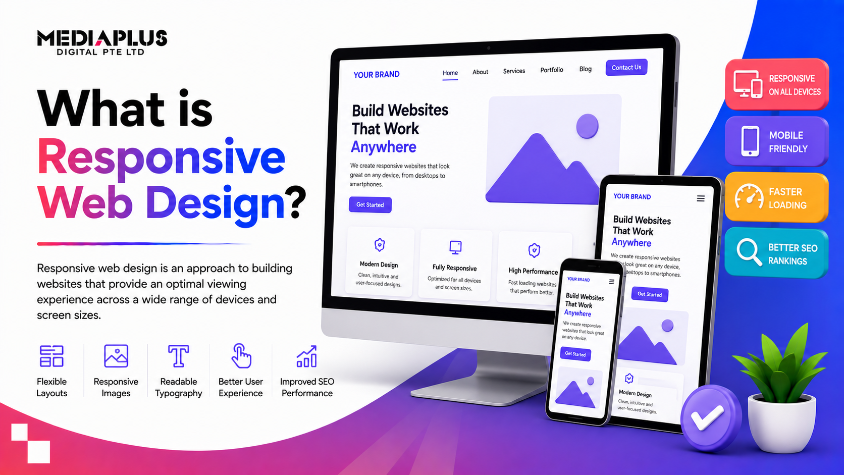
7. Mobile-First Design
More than 55% of global web traffic now comes from mobile devices. Designing for desktop first is no longer enough.
Mobile-first design focuses on:
-
Essential content prioritisation
-
Thumb-friendly buttons
-
Simple menus
-
Fast loading times
A site that works well on mobile improves performance across all devices.
8. Page Speed and Performance
Page speed is both a technical and a design responsibility. Visual choices directly affect how fast a site loads and how users perceive it.
Research shows that:
-
Bounce rates can increase by up to 90% when page load time exceeds 5 seconds
-
Even a 1-second delay can reduce conversions significantly
Design-related performance improvements include:
-
Compressing and properly sizing images
-
Avoiding unnecessary animations and effects
-
Using clean, efficient layouts
-
Reducing reliance on heavy third-party scripts
Fast websites feel smoother, more reliable, and more professional. Users are far more likely to trust and engage with a site that responds instantly.
Speed is not just about rankings. It is about respecting users’ time.
9. Accessibility
Accessible design ensures that everyone can use your website, including users with visual, motor, or cognitive impairments.
Accessibility is no longer optional. It is a usability standard and, increasingly, a legal and ethical requirement.
Key accessibility principles include:
-
Sufficient colour contrast for readability
-
Alt text for images to support screen readers
-
Keyboard-friendly navigation without mouse dependency
-
Clear visual focus indicators for interactive elements
Accessible websites are easier for everyone to use, not just users with disabilities. Many accessibility improvements directly enhance overall UX and SEO.
Search engines favour sites that are structured, readable, and easy to navigate. Accessibility supports all three.
10. Continuous Testing and Improvement
Great web design is never static. User behaviour changes, technologies evolve, and business goals shift.
High-performing websites are continuously refined through:
-
Analytics and user behaviour tracking
-
Heatmaps and session recordings
-
A/B testing of layouts, content, and CTAs
-
Iteration based on real usage data
Design decisions backed by data consistently outperform assumptions or personal preferences. What looks good to a designer may not always perform best for users.
Continuous improvement turns a website from a one-time project into a long-term growth asset.
Why Web Design Principles Matter for Business Growth
Strong web design principles support:
-
Higher conversion rates
-
Better search visibility
-
Stronger brand perception
-
Lower bounce rates
-
Improved customer trust
Design is not decoration. It is a strategic business tool.
Final Thoughts: Applying Web Design Principles in the Real World
Effective web design balances aesthetics, usability, and performance. A visually impressive site means little if users cannot understand it, navigate it, or take action.
The best websites:
- Communicate value clearly
- Guide users intuitively
- Load fast across devices
- Continuously evolve based on data
For businesses investing in web design Malaysia, applying these principles consistently is what separates average websites from high-performing digital assets.
At MediaPlus Malaysia, web design is approached as part of a broader growth strategy. By combining strong design principles with SEO, performance optimisation, and user-centric thinking, brands can build websites that do more than look good. They drive real business results.
If your goal is a website that converts, scales, and supports long-term growth, applying proven web design principles from the start makes all the difference.