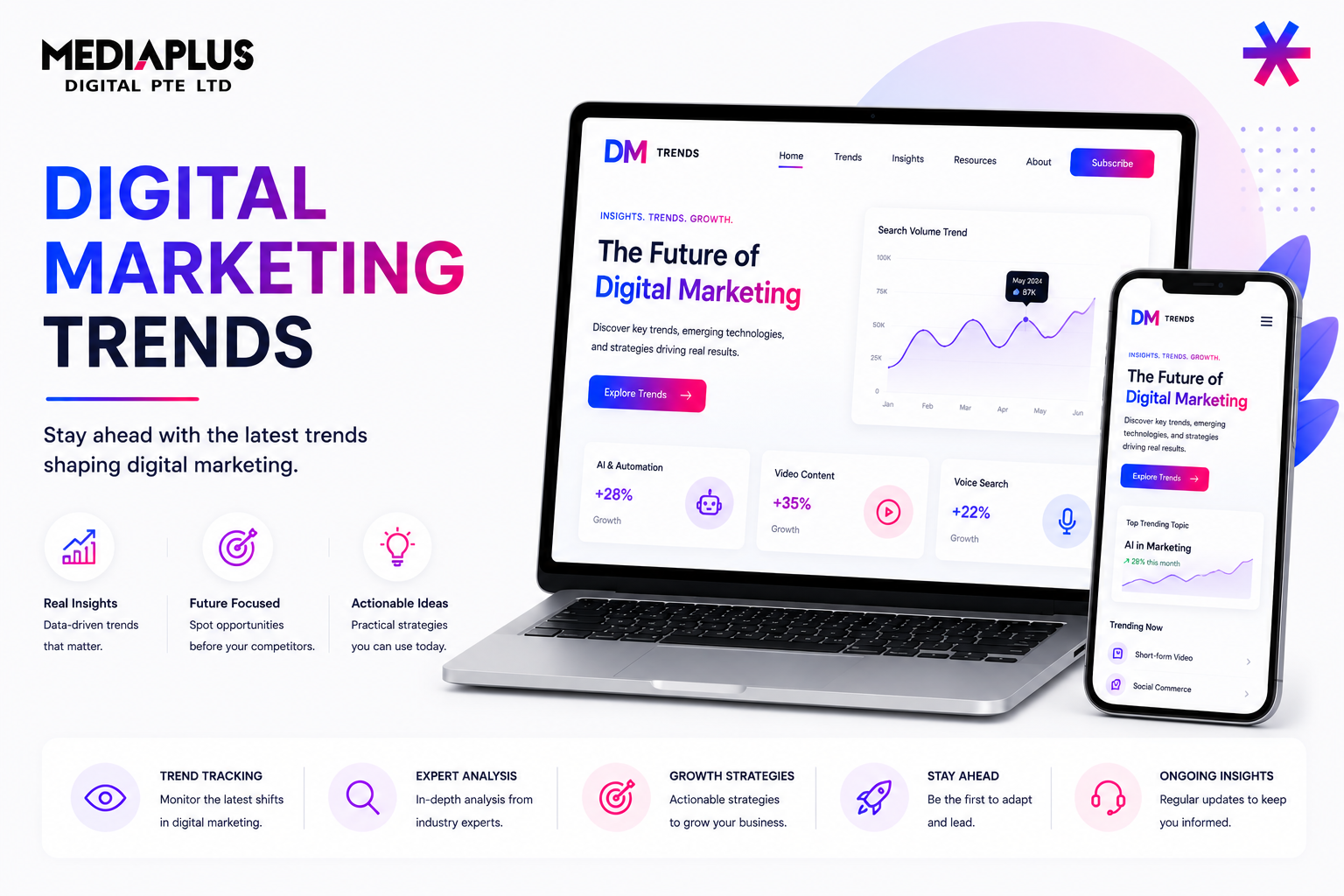
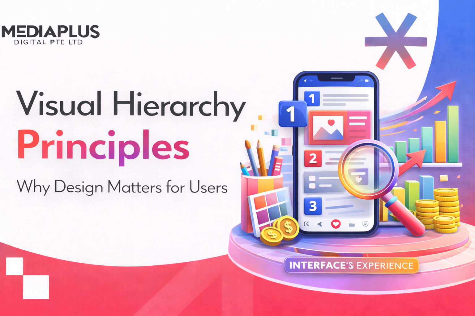
When a visitor lands on your website, they do not read every word from top to bottom. They scan. In under 3 seconds, they decide whether to stay or leave based on what their eyes catch first. Visual hierarchy is the design principle that controls what users see first, second, and third, guiding their attention through your content in the order that matters most.
Strong visual hierarchy reduces confusion, lowers cognitive load, and helps people take the right action. Weak visual hierarchy creates pages where everything competes for attention, nothing stands out, and users leave without converting.
Whether you are designing a landing page, an e-commerce store, or a corporate website, understanding visual hierarchy principles is essential to creating pages that both look professional and convert visitors into customers.
What Is Visual Hierarchy?
Visual hierarchy refers to the organisation of design elements on a page so that the eye is guided to consume each element in order of intended importance. It is the system that tells users what to look at first, what to read next, and what action to take.
Every design element on a page carries visual weight. Larger elements feel more important than smaller ones. Bold text stands out against regular text. Bright colours attract attention before muted ones. Visual hierarchy leverages these natural perceptions to create a clear reading order without the user even realising it.
Without visual hierarchy, a page becomes a wall of equally weighted content. Users do not know where to start, what matters, or what you want them to do. The result is higher bounce rates, lower engagement, and missed conversions.
Why Visual Hierarchy Matters for Your Website
Visual hierarchy is not just a design concept for designers to worry about. It has direct, measurable impact on business outcomes:
- Faster comprehension: Users can understand your page and its purpose within seconds rather than having to work to figure out what you offer.
- Higher engagement: When content is organised in a clear hierarchy, users spend more time on the page and consume more content.
- Better conversion rates: A clear visual path that leads to your call-to-action means more clicks, sign-ups, enquiries, and purchases.
- Reduced bounce rates: Users who can quickly find what they need are far less likely to hit the back button.
- Improved accessibility: Good hierarchy benefits all users, including those with cognitive disabilities or visual impairments who rely on clear content structure.
- Stronger brand perception: Well-organised, visually consistent pages signal professionalism and attention to detail.
Research from Wichita State University found that layouts with generous margins and spacing improved comprehension and user preference. Understanding why website design is important starts with understanding how visual hierarchy shapes every visitor interaction.
10 Core Visual Hierarchy Principles
1. Size and Scale
Larger elements attract attention first. This is the most fundamental principle of visual hierarchy. When users scan a page, their eyes are naturally drawn to the biggest elements before anything else.
How to apply size effectively:
- Headlines should be significantly larger than body text. A clear size difference between H1, H2, H3, and body copy creates an instant reading order.
- Limit your design to 3 type sizes. More than three distinct sizes creates confusion rather than clarity. Use large for primary headings, medium for subheadings, and small for body text.
- Make your primary CTA button the largest interactive element. If everything is the same size, nothing stands out.
- Use size to establish content priority. Hero headlines, key statistics, and primary offers should be visually larger than supporting content.
Example: Apple’s product pages use a single large product image with a clear headline and one focused call-to-action. The size difference between elements makes the reading order unmistakable.
2. Colour and Contrast
Contrast creates focus. The difference in value and saturation between elements, not the specific colour itself, is what creates hierarchy. High-contrast elements stand out. Low-contrast elements recede into the background.
How to use colour and contrast:
- Use a bold, contrasting colour for your primary CTA. A bright button against a muted background draws immediate attention.
- Limit your colour palette to 2 to 3 primary colours. Too many colours compete with each other and weaken the hierarchy.
- Use colour consistently to signal meaning. For example, blue for links, green for success messages, red for errors. Consistency helps users learn your interface.
- Create contrast between text and background. Dark text on light backgrounds (or vice versa) is essential for readability. WCAG guidelines recommend a minimum contrast ratio of 4.5:1 for body text.
Bright colours advance visually while muted tones recede. Use this principle to make important elements “pop” against quieter surroundings.
3. Typography
Typography is one of the most powerful tools for establishing hierarchy. Through variations in font size, weight, style, and spacing, you can create clear levels of importance without changing any other design element.
Typography hierarchy best practices:
- Use font weight to signal importance. Bold text naturally attracts more attention than regular weight. Use bold for headings and key phrases, regular weight for body text.
- Establish a clear type scale. Define specific sizes for H1, H2, H3, body text, and captions. Maintain this scale consistently throughout the entire site.
- Limit yourself to 2 font families maximum. One for headings and one for body text is a reliable approach. Too many fonts create visual noise.
- Use line height and letter spacing. Generous line height (1.5 to 1.8 for body text) improves readability. Slight letter spacing in uppercase headings improves legibility.
- Consider font style for emphasis. Italics, uppercase, and different weights all create typographic contrast without adding new fonts.
In 2026, typography is moving beyond pure legibility into brand storytelling. Custom fonts, oversized headlines, and layered type styles are increasingly used to create distinctive visual identities.
4. White Space (Negative Space)
White space is not wasted space. It is one of the most valuable tools in visual hierarchy. The empty areas around and between design elements give the eye room to travel, help separate distinct sections, and draw attention to the elements that matter.
How to use white space effectively:
- Give important elements more breathing room. A call-to-action button surrounded by generous white space stands out far more than one crowded by other elements.
- Use spacing to group related content. Elements that belong together should have less space between them than elements that are separate. This is the principle of proximity.
- Do not be afraid of empty space. Many businesses feel the urge to fill every pixel. Resist this. Cluttered pages overwhelm users. Clean pages convert.
- Use consistent spacing values. A spacing system (for example, 8px, 16px, 24px, 32px, 48px) creates rhythm and visual consistency across the page.
White space does not need to be white. It simply refers to any area of a design that is free of content. It could be any colour or even a background image, as long as it provides visual breathing room.
5. Reading Patterns (F-Pattern and Z-Pattern)
Users do not read web pages linearly. Eye-tracking research has identified two dominant scanning patterns that designers should leverage:
The two key reading patterns:
- F-Pattern: On text-heavy pages (blogs, articles, search results), users scan in an F-shape. They read across the top, then move down and read a shorter horizontal line, then scan vertically down the left side. This is why headings, subheadings, and the first few words of each paragraph are critical.
- Z-Pattern: On pages with less text and more visual elements (landing pages, homepages), users scan in a Z-shape: top-left to top-right, then diagonally down to bottom-left, then across to bottom-right. Place your logo top-left, navigation top-right, key message centre, and CTA bottom-right.
Understanding these patterns allows you to position your most important content, headlines, and calls-to-action exactly where users are most likely to look.
This is especially important when designing landing pages where every element must guide the user toward a single conversion goal.
6. Alignment and Grid Systems
Alignment creates order and professionalism. When elements are aligned to a consistent grid, the page feels structured and trustworthy. When alignment is off, even slightly, the page feels chaotic and unprofessional.
Alignment principles:
- Use a grid system. A 12-column grid is the standard for web design. It provides flexible layout options while maintaining consistent alignment across different sections.
- Align text consistently. Left-aligned text is the most readable for left-to-right languages. Avoid centre-aligning large blocks of body text as it creates a ragged edge that slows reading.
- Maintain consistent margins and padding. Every section and element should follow the same spacing rules. Inconsistency creates visual tension.
- Use the rule of thirds. Divide your layout into a 3×3 grid. Placing key elements at the intersection points creates natural focal points that feel balanced and intentional.
The fastest way to break hierarchy is inconsistency. If fonts, colours, or layouts change unpredictably, the entire design loses credibility.
7. Proximity and Grouping
Elements placed close together are perceived as related. This is one of the Gestalt principles of perception, and it is fundamental to creating clear content relationships on a page.
How to use proximity:
- Group related content visually. A product image, its title, price, and “Add to Cart” button should be visually grouped with tight spacing between them.
- Separate unrelated content with space. Different sections of a page should have clear visual separation through spacing, dividers, or background colour changes.
- Use cards for discrete content units. Cards (bordered or shadowed containers) are an effective way to group related information, especially in grid layouts with multiple items.
- Labels should be close to their fields. In forms, labels positioned directly above or beside their input fields are easier to understand than labels separated by large gaps.
Proximity eliminates the need for excessive borders, lines, or boxes. Proper spacing alone communicates relationships clearly.
8. Visual Cues and Direction
Visual cues guide users toward specific actions. Arrows, icons, images of people looking in a direction, and lines all direct the viewer’s eye to where you want it to go.
Types of visual cues:
- Directional cues: Arrows pointing toward a CTA, lines leading to a form, or images of people looking toward key content.
- Icons: A magnifying glass for search, a shopping cart for checkout, an envelope for email. Icons provide instant recognition and reduce cognitive load.
- Colour cues: Using a distinct colour for interactive elements (buttons, links) teaches users what is clickable.
- Motion cues: Subtle animations that draw attention to important elements, such as a gently pulsing CTA button or a sliding notification.
Use visual cues sparingly. Too many competing directional signals confuse rather than guide. Every cue should serve a clear purpose.
9. Repetition and Consistency
Repetition creates patterns that users learn and rely on. When the same visual treatment is applied consistently, users build mental models of how your site works, reducing the effort needed to navigate and understand new pages.
Where consistency matters most:
- Navigation: Keep your menu structure, placement, and styling identical across every page.
- Headings: H1, H2, and H3 should always look the same (font, size, colour, spacing) regardless of which page they appear on.
- Buttons: Primary and secondary buttons should have consistent styles throughout the site. Users should instantly recognise what is clickable.
- Spacing: Use the same spacing values between sections, around elements, and within components across the entire site.
- Colour usage: If blue means “link” on one page, it should mean “link” on every page. Inconsistent colour usage breaks user trust.
A design system (a documented library of reusable components and guidelines) is the most effective way to maintain consistency at scale.
10. Perspective and Depth
Elements that appear closer feel more important. Techniques like shadows, layering, and parallax effects create a sense of depth that adds another dimension to your visual hierarchy.
How to create depth:
- Shadows: Subtle drop shadows on cards, buttons, and modals create the illusion that they are floating above the page, drawing attention.
- Layering: Overlapping elements (text over images, modals over page content) create visual depth and focus attention on the foreground layer.
- Background blur: Blurring background content when a modal or popup appears directs full attention to the foreground element.
- Elevation: Material Design’s elevation system assigns different shadow depths to different UI components, creating a clear hierarchy of interactive elements.
Use depth effects with restraint. Overuse creates visual clutter. The goal is subtle emphasis, not 3D theatrics.
Visual Hierarchy in Action: Real-World Examples
Studying how leading websites apply visual hierarchy principles can inform your own design decisions:
- Google: The homepage is a masterclass in visual hierarchy through simplicity. The search bar dominates the page, surrounded by vast white space. There is no competing content. The user’s eye goes directly to the single input field.
- Apple: Product pages use a large hero image, a clear headline, a brief description, and a focused CTA. Size, contrast, and white space work together to create an unmistakable reading order.
- Airbnb: Search results use prominent photos, visible pricing, clear location details, and secondary information (reviews, amenities) in smaller, lighter text. The hierarchy prioritises what matters most to travellers.
- Amazon: Despite a dense layout, the product page isolates the “Buy Now” and “Add to Cart” buttons using colour, size, and spacing. The buy box is visually separated from the rest of the content.
For more inspiration on how to design pages that convert, explore these best landing page examples with analysis of what makes them effective.
The Squint Test: A Quick Way to Check Your Visual Hierarchy
One of the simplest and most effective ways to evaluate visual hierarchy is the squint test:
- Open your webpage on screen.
- Squint your eyes or apply a blur filter to the design.
- Observe what stands out. Can you still identify the main heading? Does the primary CTA remain visible? Are the key content areas distinguishable?
If everything blends into an even blur, your hierarchy is weak. If certain elements clearly stand out in the right order (heading first, then subheading, then CTA), your hierarchy is working.
This test takes 10 seconds and can reveal hierarchy problems that hours of detailed review might miss.
Common Visual Hierarchy Mistakes to Avoid
- Everything is bold or large: When every element screams for attention, nothing stands out. Hierarchy requires contrast between important and supporting elements.
- Inconsistent heading styles: If H2 headings look different across pages, users lose confidence in the visual system and have to work harder to navigate.
- Too many colours: A page with 6 or more colours competing for attention creates visual chaos. Limit your palette and use accent colours strategically.
- Cramped layouts: Filling every pixel with content eliminates the white space that creates hierarchy. Give elements room to breathe.
- Burying the CTA: If your primary call-to-action looks the same as surrounding content, users will miss it. CTAs need size, colour, and spacing to stand out.
- Ignoring mobile hierarchy: Visual hierarchy that works on desktop often breaks on mobile. Test your hierarchy on actual mobile devices, not just browser resizing tools.
How Visual Hierarchy Connects to SEO
Visual hierarchy is not just a design concern. It directly impacts your SEO performance:
- Heading structure (H1, H2, H3): Search engines use heading tags to understand content structure and topic hierarchy. A clear heading structure improves both user experience and search engine comprehension.
- User engagement signals: Google measures metrics like time on page, bounce rate, and pages per session. Good visual hierarchy keeps users engaged longer, sending positive signals to search engines.
- Core Web Vitals: Layout shifts caused by poor hierarchy (elements jumping around as the page loads) negatively impact your Cumulative Layout Shift (CLS) score, which is a direct ranking factor.
- Featured snippets: Well-structured content with clear headings and logical hierarchy is more likely to be selected for Google’s featured snippets and AI-generated answers.
Understanding what SEO is and how it works alongside visual hierarchy principles helps you create pages that satisfy both users and search engines.
Applying Visual Hierarchy to Your Website
Ready to improve the visual hierarchy of your website? Start with these practical steps:
- Audit your current pages. Use the squint test on your homepage, key service pages, and landing pages. Identify where hierarchy is weak.
- Define your heading scale. Set specific sizes, weights, and colours for H1, H2, H3, body text, and captions. Apply them consistently across every page.
- Review your CTA visibility. Ensure your primary call-to-action on each page is the most visually prominent interactive element.
- Add white space. Increase padding around key elements and between sections. Give your content room to breathe.
- Test on mobile. Check that your hierarchy translates to smaller screens. Adjust element sizes and spacing for mobile if needed.
- Simplify your colour palette. Reduce to 2 to 3 primary colours plus 1 accent colour for CTAs and important highlights.
If you need expert help redesigning your website with strong visual hierarchy, MediaPlus Digital offers professional web design services built on proven UX principles. From e-commerce web design to corporate websites, the team creates designs that guide users toward conversion through intentional visual hierarchy.
Want a website that looks great and converts? Contact MediaPlus Digital for a consultation.