A great landing page can be the difference between a campaign that performs and one that wastes budget.
When done right, a landing page doesn’t just look good. It guides visitors toward a clear action, builds trust quickly, and removes every possible friction point in the conversion journey. When done poorly, even high-quality traffic from paid ads or SEO will fail to convert.
In this guide, we’ll explore some of the best landing page examples, break down what makes them effective, and show you how to apply those principles to your own campaigns.
Key Takeaways
High-converting landing pages are not built by chance. They are designed around a single, clear objective, supported by strong messaging and a distraction-free experience. The most successful pages guide users step by step toward a decision, rather than overwhelming them with options.
What is a Landing Page?
A landing page is a standalone web page created specifically for a marketing or advertising campaign. Unlike a full website that allows users to explore different sections, a landing page is focused on one goal only.
That goal could be generating leads, driving purchases, collecting sign-ups, or encouraging users to book a consultation. Visitors typically arrive on a landing page after clicking on an ad, an email link, or a social media promotion.
Because of this, landing pages are not designed for exploration. They are designed for action.
What Makes a Landing Page Effective?
Before looking at real examples, it’s important to understand the underlying principles that make landing pages work.
A high-performing landing page starts with clarity. When a user lands on the page, they should immediately understand what is being offered and why it matters to them. This is usually communicated through a strong headline supported by concise and benefit-driven copy.
Another critical factor is focus. Unlike a homepage, a landing page should not have multiple navigation paths. Too many options create confusion and reduce conversions. The best landing pages remove unnecessary links and guide users toward a single call-to-action.
Trust also plays a major role. Visitors are often unfamiliar with your brand, so elements such as testimonials, reviews, client logos, and statistics help reduce hesitation. These signals reassure users that others have already trusted your product or service.
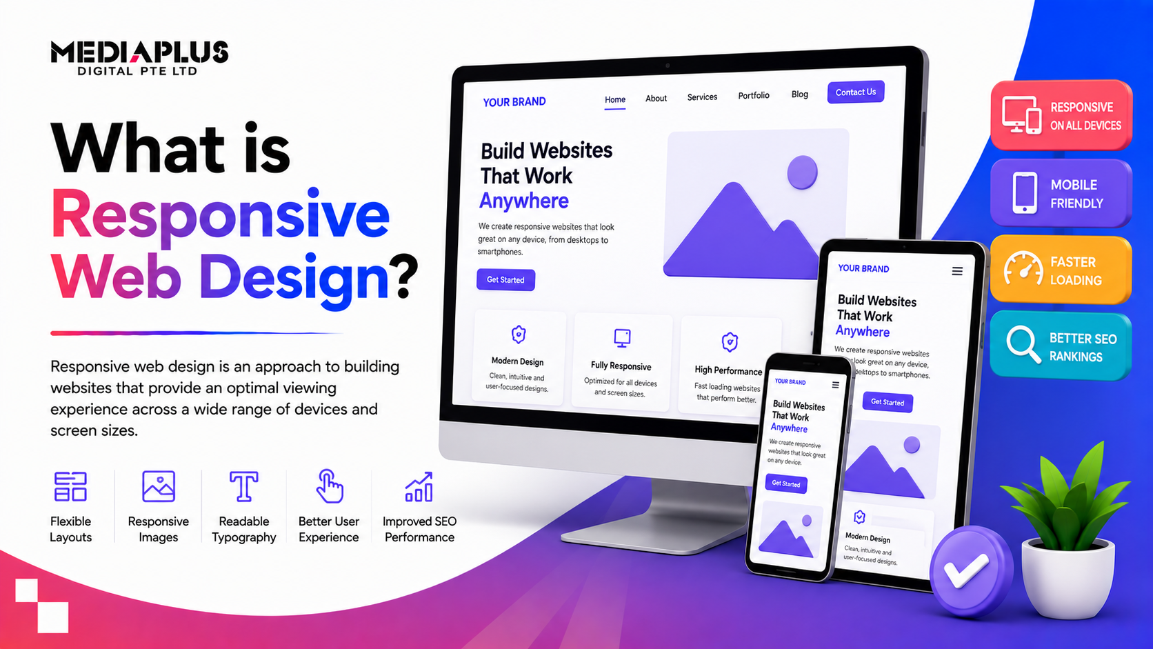
Finally, design and user experience must support the goal. A clean layout, fast loading speed, and mobile responsiveness all contribute to better performance.
The Best Landing Page Examples
To understand how these principles come together, let’s look at some real-world examples and what makes them effective.
Calm: Simplicity That Matches the Product Experience
Calm’s landing page is a perfect example of alignment between product and design. The page uses soft colors, minimal text, and a clean layout to reflect the core promise of the product, which is relaxation and mental clarity.
Instead of overwhelming visitors with features, the page focuses on outcomes such as better sleep and reduced stress. The messaging is short, direct, and emotionally appealing. This creates an immediate connection with users who are looking for a solution to their problem.
What makes this page effective is not complexity, but restraint. It proves that sometimes less content leads to better results.
Netflix: Reducing Friction to the Absolute Minimum
Netflix takes a different approach by focusing entirely on simplicity and ease of use.
The landing page features a single input field asking for an email address. There are no complicated forms, no unnecessary steps, and no distractions. This dramatically reduces friction and makes it easy for users to get started.
The copy is also extremely concise. Instead of explaining everything about the service, Netflix highlights the core value proposition and allows users to explore further only after they have taken the first step.
This approach works particularly well for mass-market products where ease and accessibility are key.
LinkedIn Premium: Targeted Messaging for a Specific Audience
LinkedIn’s landing page is designed with a very specific audience in mind: professionals looking to advance their careers.
The page combines human-centered visuals with product features, creating a balance between emotional appeal and functionality. It also uses data-driven statements to reinforce credibility and demonstrate value.
Rather than trying to appeal to everyone, the page speaks directly to a niche audience. This level of targeting increases relevance and improves conversion rates.
SEMrush: Strong CTA and Data-Driven Appeal
SEMrush’s landing page focuses on a single compelling action: discovering competitor insights.
The call-to-action is clear, specific, and aligned with user intent. Instead of generic phrases like “Learn More,” it encourages users to take a meaningful step that delivers immediate value.
The page also uses multiple forms of social proof, including brand logos and testimonials, to build trust quickly. Combined with benefit-driven copy, this creates a strong persuasive experience.
DoorDash: Selling Lifestyle and Benefits
DoorDash’s landing page targets potential drivers and focuses heavily on lifestyle benefits.
Instead of explaining the platform in detail, the page emphasizes flexibility, independence, and earning potential. This aligns with the motivations of the target audience and makes the offer more appealing.
The inclusion of earning estimates and requirements helps users quickly determine whether the opportunity is right for them. This not only improves conversions but also ensures higher-quality leads.
Perfect Keto: Combining Product and Storytelling
Perfect Keto’s landing page is a strong example of how storytelling can enhance product marketing.
The page highlights not just the product features, but also the lifestyle associated with it. It uses testimonials, influencer endorsements, and detailed explanations to build trust and credibility.
By showing how the product fits into real-life scenarios, the page helps users visualize the benefits more clearly. This makes it easier for them to make a purchase decision.
Best Landing Page Examples by Goal
Not all landing pages serve the same purpose, and understanding the goal is essential for choosing the right approach.
For lead generation, simplicity is key. Pages like Netflix and Amazon focus on reducing friction and capturing user information quickly.
For product sales, pages such as Perfect Keto and Branch Furniture emphasize benefits, visuals, and persuasive messaging to drive purchases.
For storytelling, examples like Grass Roots use narrative techniques to guide users through a journey, building emotional connection before presenting the offer.
For sign-ups and registrations, pages like Athabasca University focus on clarity and reducing barriers, making it easier for users to take action.
How to Create a High-Converting Landing Page
Creating an effective landing page requires a structured approach.
It starts with defining a clear objective. Without a specific goal, it becomes difficult to design a page that converts.
Next, the messaging must be crafted carefully. The headline should capture attention immediately, while the supporting content should reinforce the value proposition without overwhelming the reader.
Design plays a supporting role. A clean and intuitive layout helps users focus on the key message and action. Mobile optimization is also critical, as a large portion of traffic comes from mobile devices.
Finally, testing and optimization are essential. No landing page is perfect from the start. Continuous testing allows you to identify what works and improve performance over time.
How MediaPlus Digital Malaysia Can Help
Building a high-converting landing page requires more than just design skills. It involves a combination of strategy, data analysis, and continuous optimization.
MediaPlus Digital Malaysia offers a comprehensive range of services to support this process.
- Their landing page design services focus on creating pages that are not only visually appealing but also structured for conversion. Every element, from layout to messaging, is designed with a clear objective in mind.
- In addition, their conversion rate optimization approach ensures that landing pages are continuously improved based on real performance data. This includes A/B testing, user behavior analysis, and funnel optimization.
- To maximize results, landing pages are integrated with paid advertising strategies such as Google Ads and social media campaigns. This ensures that the right audience is directed to the page at the right time.
- They also support long-term growth through SEO and content strategies, helping businesses attract organic traffic and build sustainable visibility.
Conclusion
The best landing page examples are not defined by flashy design or complex features. They are defined by clarity, focus, and relevance.
They communicate value instantly, guide users toward a single action, and remove every possible barrier to conversion. Whether the goal is lead generation, product sales, or brand engagement, the underlying principles remain the same.
By learning from these examples and applying a structured approach, businesses can significantly improve their marketing performance and achieve better results from their campaigns.
If you want landing pages that not only look good but also deliver measurable results, combining strong design with the right digital marketing strategy is essential.