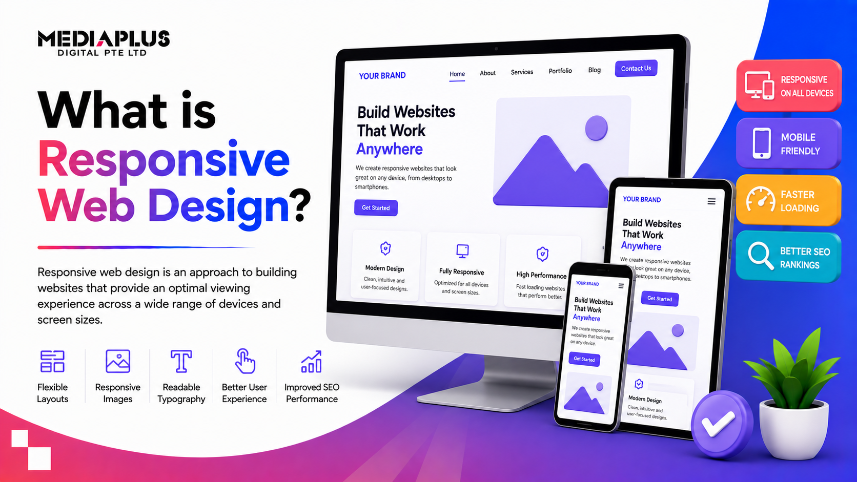
Responsive web design is what makes a website look and work well on any screen, from a phone to a laptop to a large monitor. Instead of building separate sites for each device, one responsive site adjusts itself to fit. Since most people now browse on mobile, and Google ranks the mobile version of your site first, responsive design is no longer optional. This guide explains what responsive web design is, how it works, and why it matters for your business.
What is responsive web design?
Responsive web design is an approach where a website automatically adjusts its layout, images, and content to fit the size of the screen it is viewed on. The term was coined by Ethan Marcotte in 2010, and it rests on three techniques working together: fluid grids, flexible images, and CSS media queries. The result is one website that gives a good experience on a desktop, a tablet, and a phone, without pinching, zooming, or sideways scrolling.
Why responsive web design matters
- Most traffic is mobile. More than half of web visits happen on phones, so a site that only works on desktop loses a large share of visitors.
- Google ranks mobile first. Google uses the mobile version of your site for ranking, so a poor mobile experience hurts your SEO.
- Better user experience. Visitors stay longer and convert more when a site is easy to use on their device.
- One site to maintain. A single responsive site is cheaper and simpler than separate desktop and mobile versions.
- Future-proof. New screen sizes appear all the time, and a fluid layout adapts to them without a rebuild.
How responsive web design works
Three techniques do the heavy lifting.
Fluid grids
Instead of fixing widths in pixels, a responsive layout uses relative units like percentages, so elements resize in proportion to the screen. A column that is 50% wide stays half the screen whether that screen is a phone or a monitor. Modern tools like CSS Grid and Flexbox make this easier, letting designers build layouts that flow without complex calculations.
Flexible images and media
Images and video are set to scale within their containers, so they shrink or grow with the layout instead of overflowing or forcing a horizontal scroll. This keeps everything tidy across devices.
Media queries and breakpoints
Media queries let the site apply different styles at different screen sizes. A breakpoint is the point where the layout changes, for example switching a three-column layout on desktop to a single column on mobile. You add breakpoints wherever the content starts to look cramped or awkward, so the design stays clean at every size.
Responsive vs adaptive design
People sometimes confuse the two. Responsive design uses one fluid layout that flexes smoothly to any screen. Adaptive design uses several fixed layouts, each built for a specific screen size, and serves the closest match. Responsive is the more common and flexible approach today, since it handles any screen, including sizes that did not exist when the site was built.
Best practices for responsive web design
- Design mobile-first. Start with the phone layout, then expand to larger screens. It forces you to prioritise what matters.
- Use sensible breakpoints. Add them where the content needs them, not at arbitrary device widths.
- Keep it fast. Compress images and minimise code, since mobile users leave slow sites quickly.
- Test on real devices. Emulators help, but nothing beats checking on actual phones and tablets.
- Make tap targets big enough. Buttons and links should be easy to tap with a thumb.
Frequently asked questions
What is responsive web design in simple terms?
It is a way of building a website so it automatically adjusts to look good on any device, from a phone to a desktop, using one flexible layout instead of separate sites.
Why is responsive design important?
Most people browse on mobile, and Google ranks the mobile version of your site first. A responsive site gives a good experience everywhere, which helps both rankings and conversions.
What is the difference between responsive and adaptive design?
Responsive design uses one fluid layout that flexes to any screen. Adaptive design uses several fixed layouts for specific screen sizes. Responsive is more flexible and common today.
Is my website responsive?
Open it on a phone. If you have to zoom, scroll sideways, or squint, it is not responsive. A quick check on several devices, or Google’s mobile-friendly test, will tell you.
Does responsive design help SEO?
Yes. Google uses mobile-first indexing, so a fast, mobile-friendly responsive site supports better rankings, while a poor mobile experience works against you.
Final thoughts
Responsive web design is simply building one website that works well everywhere. It uses fluid grids, flexible images, and media queries to adapt to any screen, which matters more than ever now that most traffic is mobile and Google ranks mobile first. If your site is hard to use on a phone, you are losing visitors and rankings.
If your website is not fully responsive, our web design and development team can fix or rebuild it on a fast, mobile-first foundation. Talk to MediaPlus Digital and claim a free RM300 website review.